The Screen That Made New Hires CryZSegment
Took a fragmented, expert-only tool and made it a coherent system operators could trust.
- Role
- Sole Product Designer (research, IA, interaction, visual, dev handoff)
- Team
- PM Soumya Agrawal; engineers Harish, Aravindhan, Kesav
- Timeline
- June 2023 to June 2026
- Platform
- Web app (Figma, Ant Design)
- 8
- Healthcare systems in production
- 85%
- Adopted the new save-view feature
- 3x
- Faster to find message segments
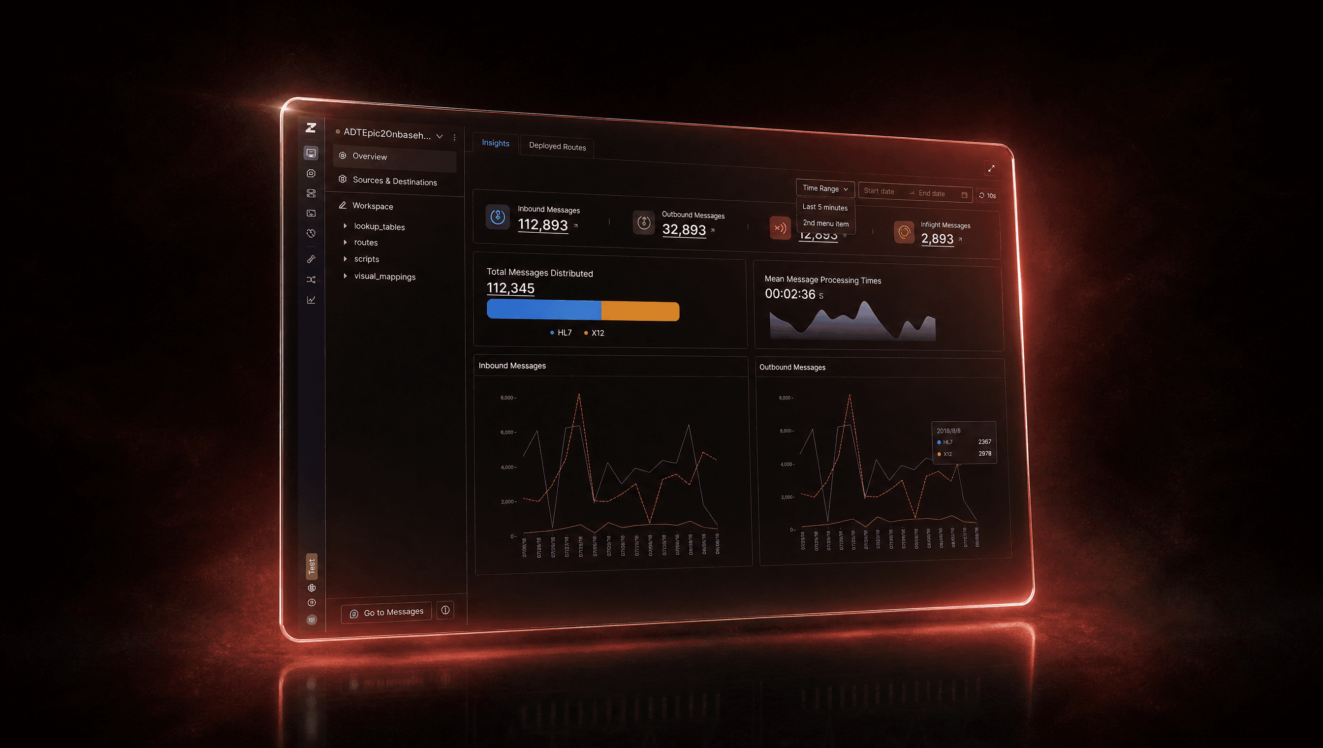
A three-year arc fixing a powerful but bewildering healthcare tool. I turned a screen that made new hires want to cry into one they could actually navigate on day one.
01 · Context & problem
A brilliant engine with a baffling dashboard
ZSegment is heavy-duty software, and the engine under it was genuinely good. The experience on top of it was not. Filters lived in two different places, so people never knew which to use. Empty screens told you nothing. Icons came from three different families that had clearly never met. Whole areas, like billing, had no real design at all.
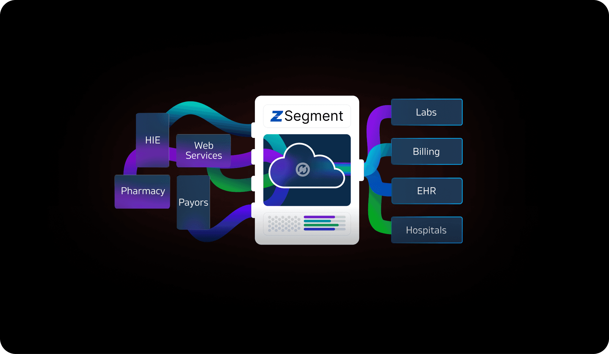
The result was predictable: extra clicks, support tickets full of "where do I click?", and a first week on the job that every new operator spent quietly lost.
02 · Role & process
Sole designer, soup to nuts
I owned research, information architecture (how the product is organized and labeled), interaction, and visual design, and I designed the marketing site and comparison page too.
Research and alignment
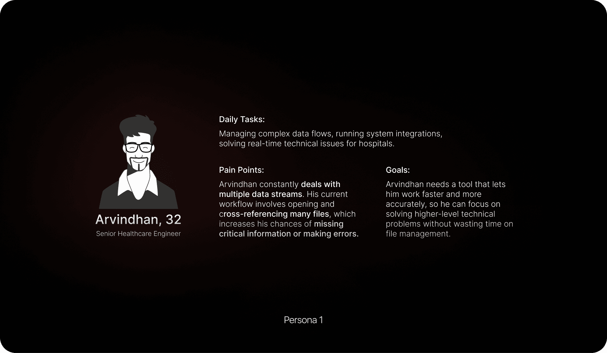
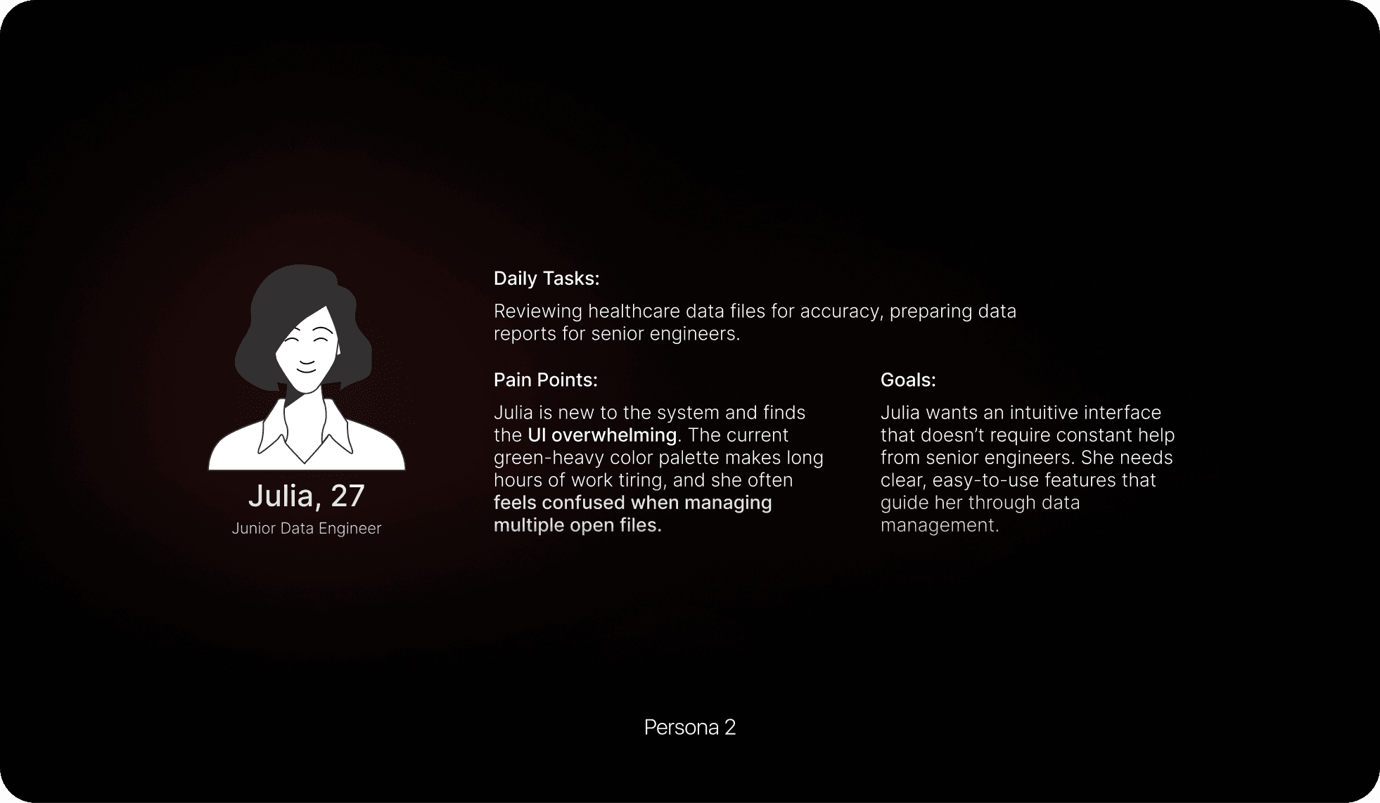
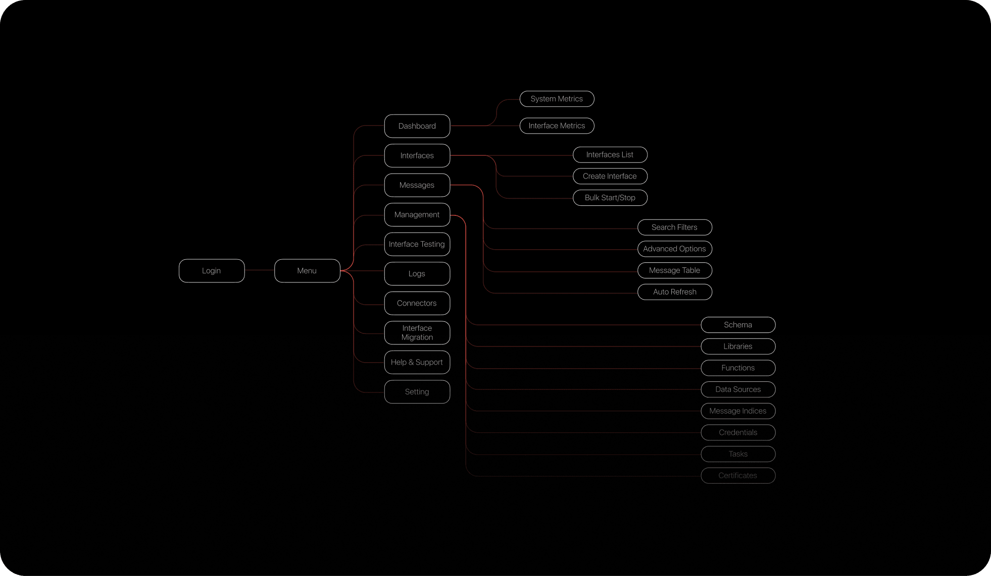
Information architecture
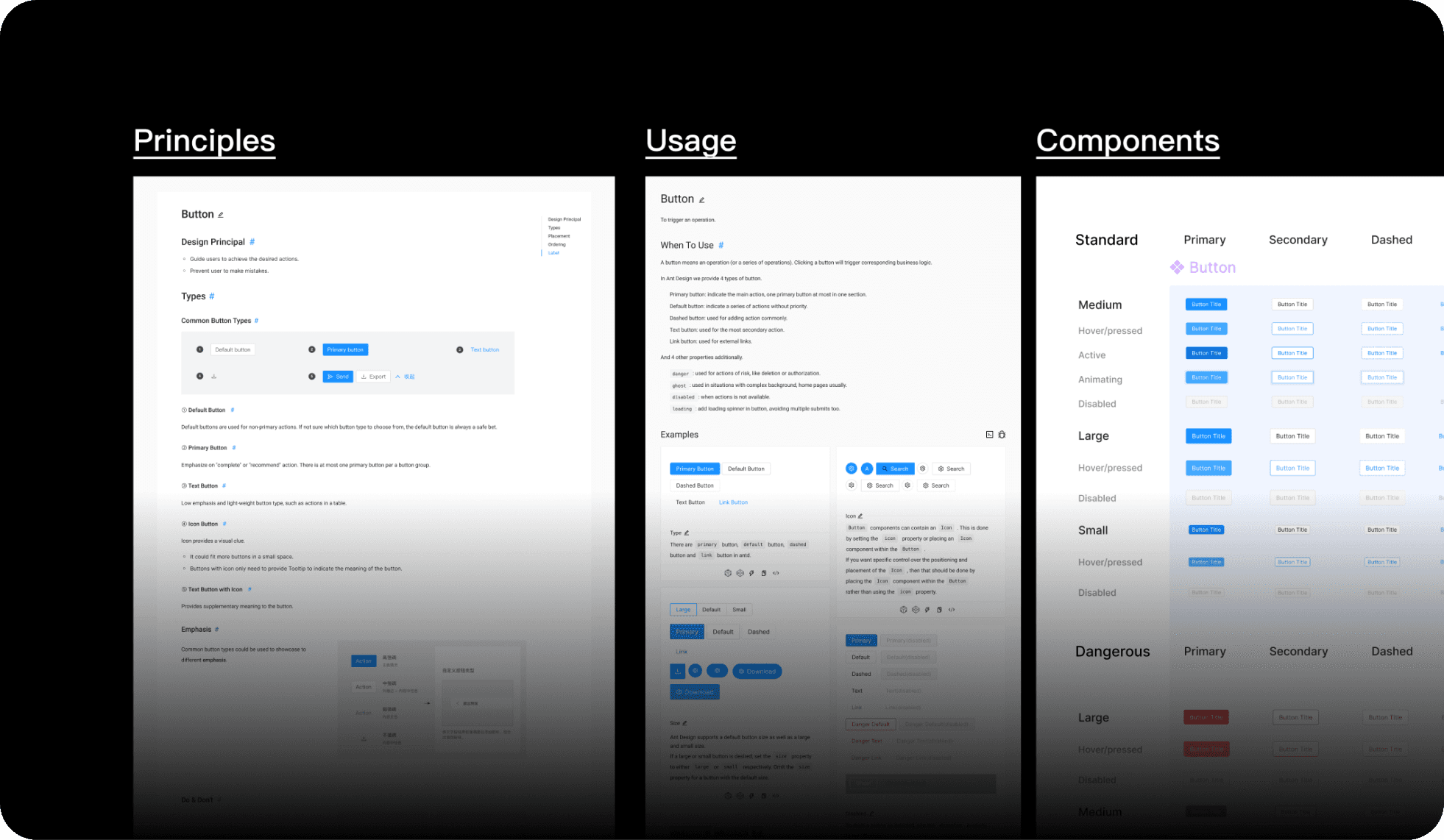
Design system
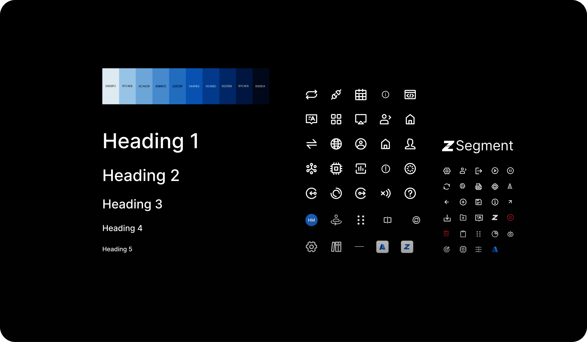
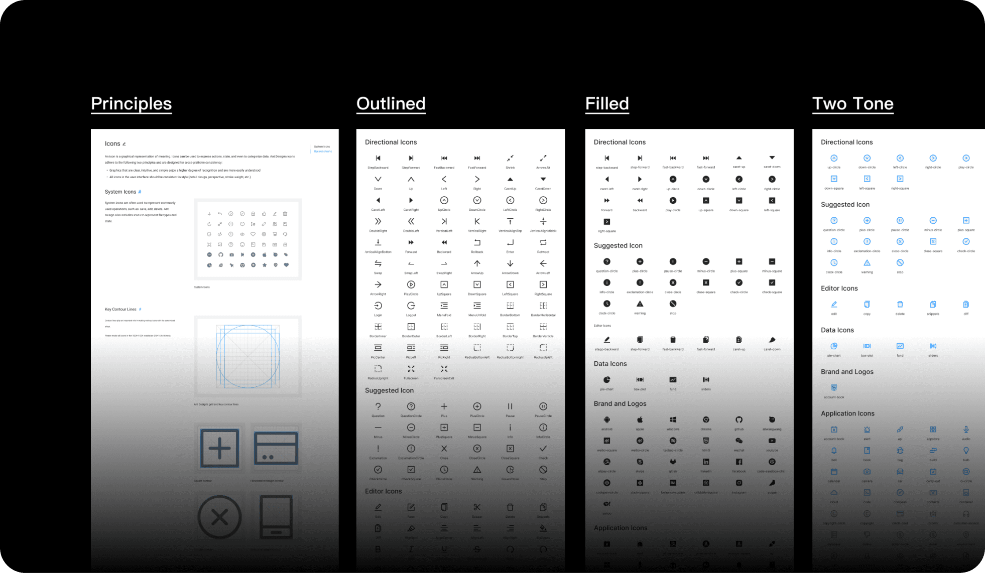
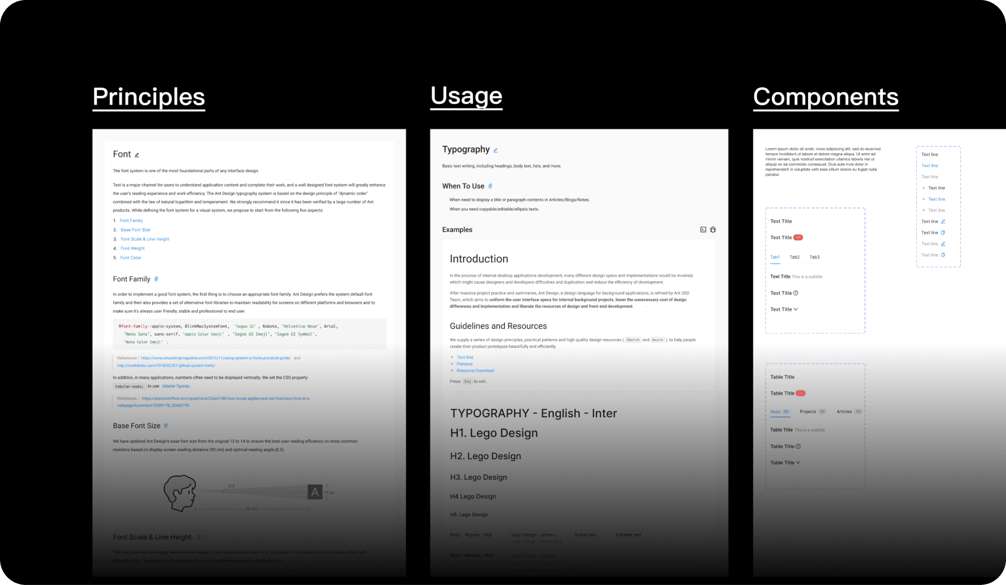
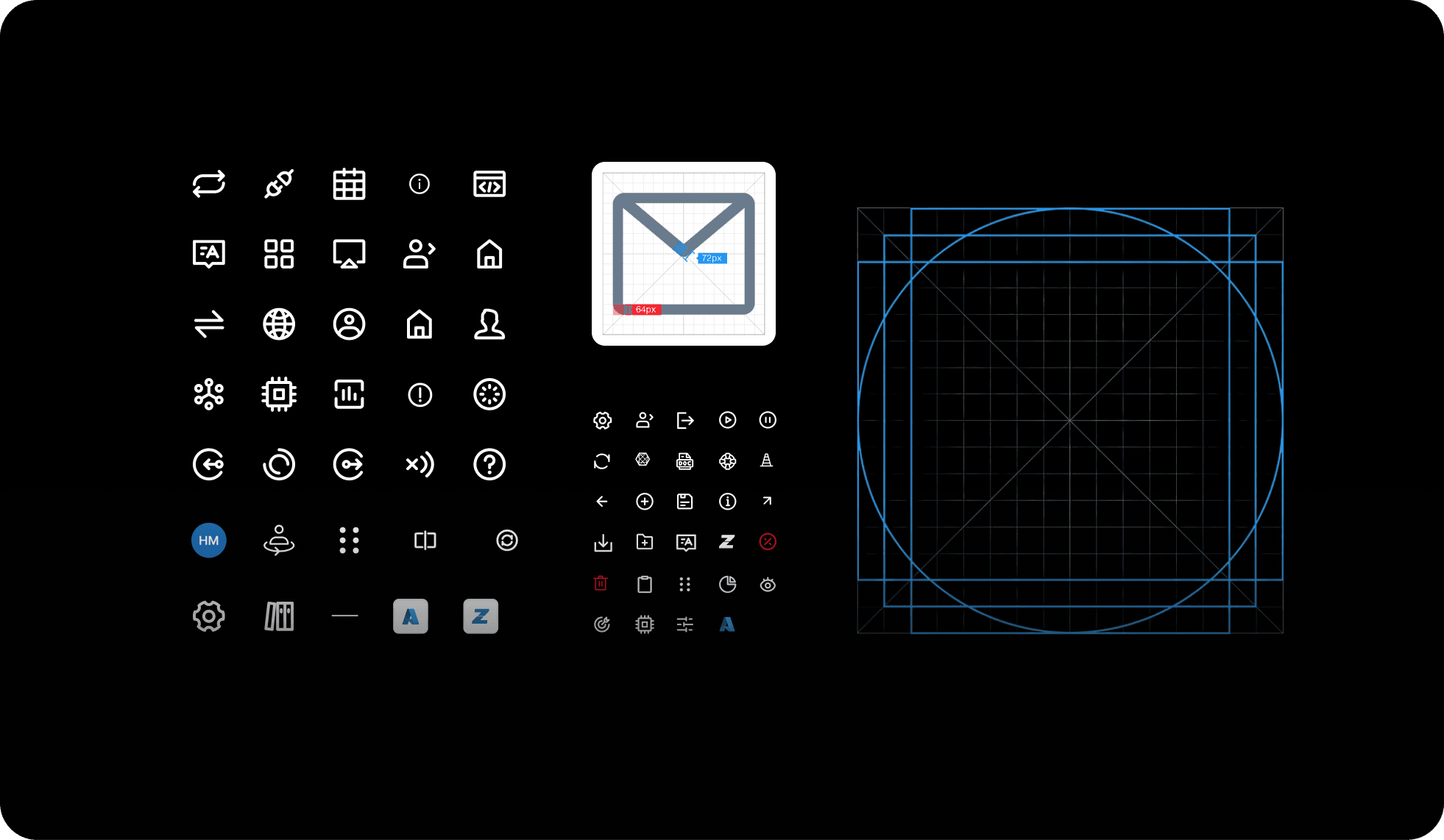
Standardized a single 16x16 icon set, fixed the typography rules, and turned error and empty states into one consistent system.
Iteration
03 · Key decisions
Three decisions that removed the confusion
Put all the filters in one place
What. Moved every filter into the left sidebar instead of splitting them between the table header and the sidebar.
Why. Dense tables need one source of truth. With filters in two spots, people set one, missed the other, and ran half a query without realizing it.
Tradeoff. A wider sidebar leaves less room for the table, which gets tight on small monitors.
Result. Operators told us filtering finally makes sense, and the "where are the filters?" tickets stopped.
Rebuilt the screen people live in
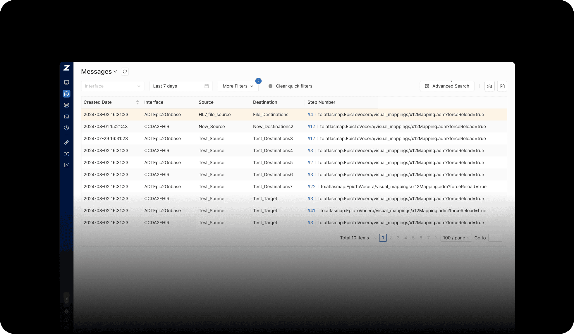
What. Redesigned the messages module (where operators spend most of their day). One search bar instead of a confusing "basic vs advanced" split, filters on top of the table, a save-view button, and the important data promoted up so it is not buried three taps deep.
Why. Roughly 60% of an operator's day is in this one screen. The old version hid the useful bits and made people re-type the same query every morning like a bad Groundhog Day loop.
Tradeoff. Expanding the segments leaves the message body less room, which we softened by letting people collapse it.
Result. Operators find segments about 3x faster, 85% of them adopted the save-view feature within two weeks, and "where is this in the drawer?" tickets dropped to zero.
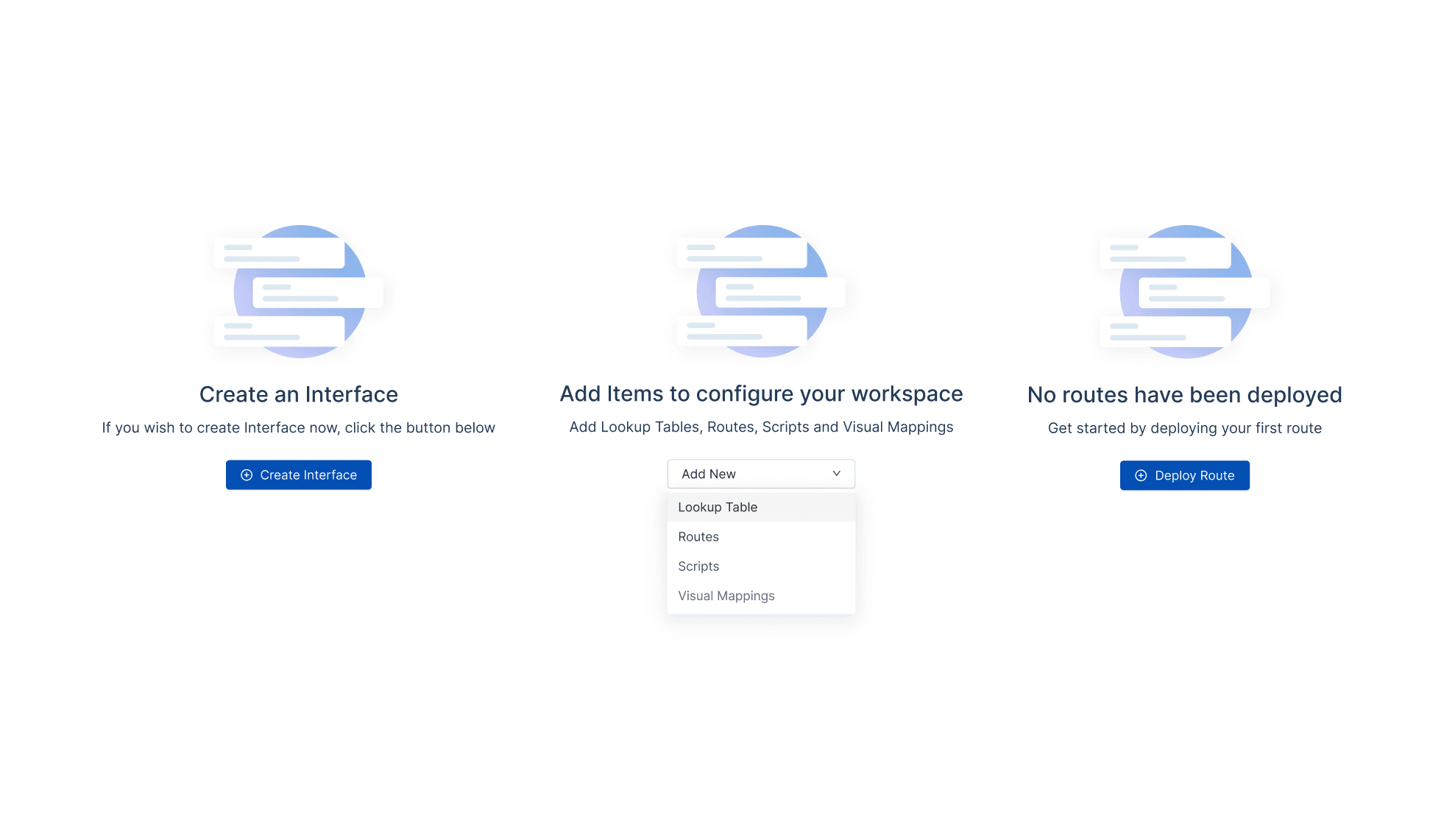
Designed five honest empty states
What. Built a distinct empty state for every "nothing here yet" moment (no interface defined, no source data, no targets, no messages, no schema selected).
Why. The old product just showed a blank screen, which left people wondering if they broke something, if data was still loading, or if the feature even applied to them.
Tradeoff. Five states take time to design, but once defined, engineers reused the pattern everywhere.
Result. Confusion tickets fell. One operator put it best: "Now I know what to do next instead of feeling lost."
04 · Solution & artifacts
The restructured product
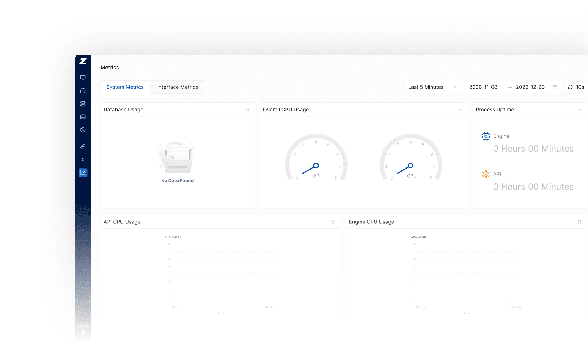
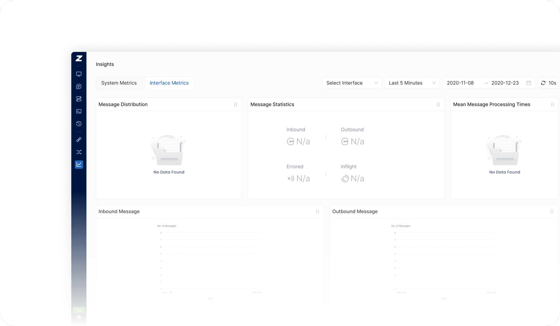
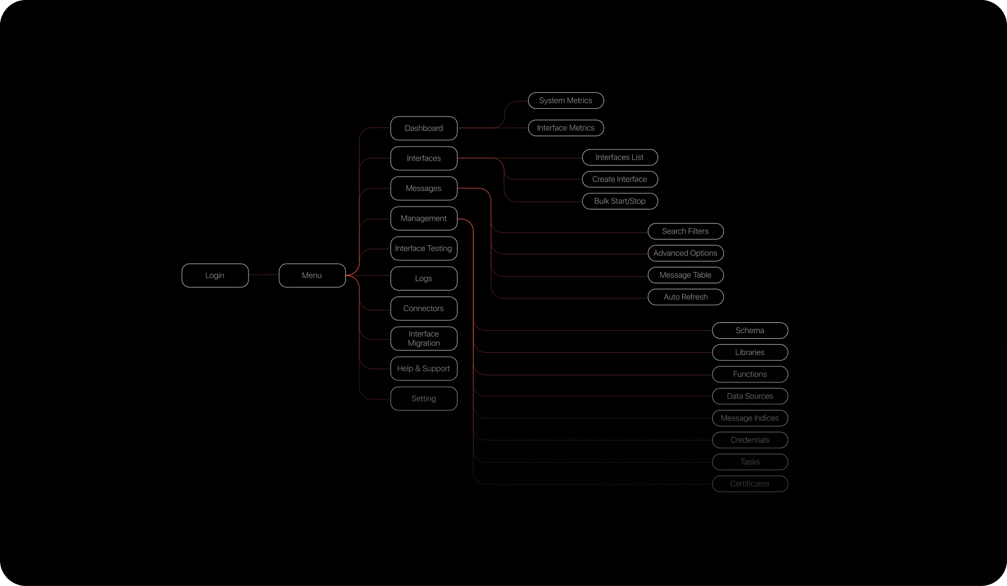
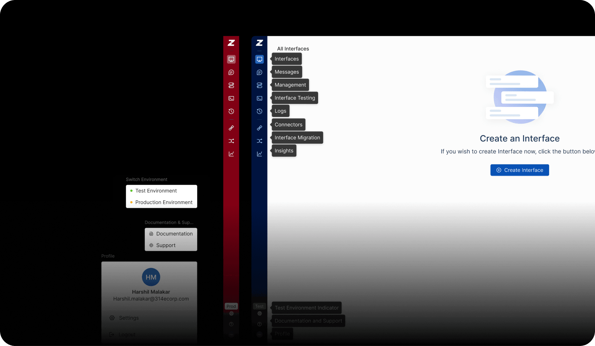
Redesigned navigation and information architecture
A reworked messages module with a cleaner drawer and one unified search
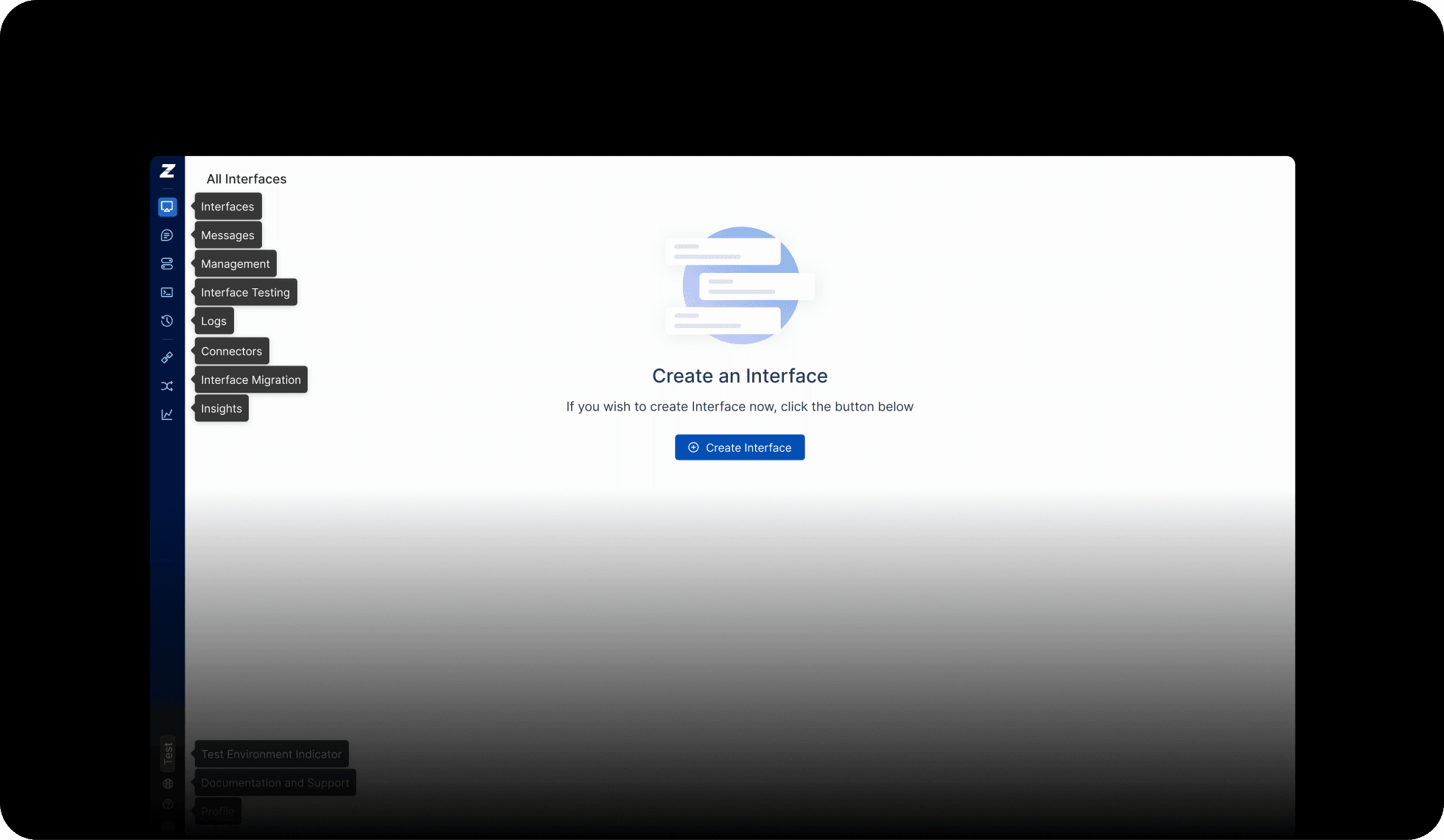
A complete five-state empty-state system
One standardized 16x16 icon set, used product-wide
Billing, subscription, and environment-settings flows
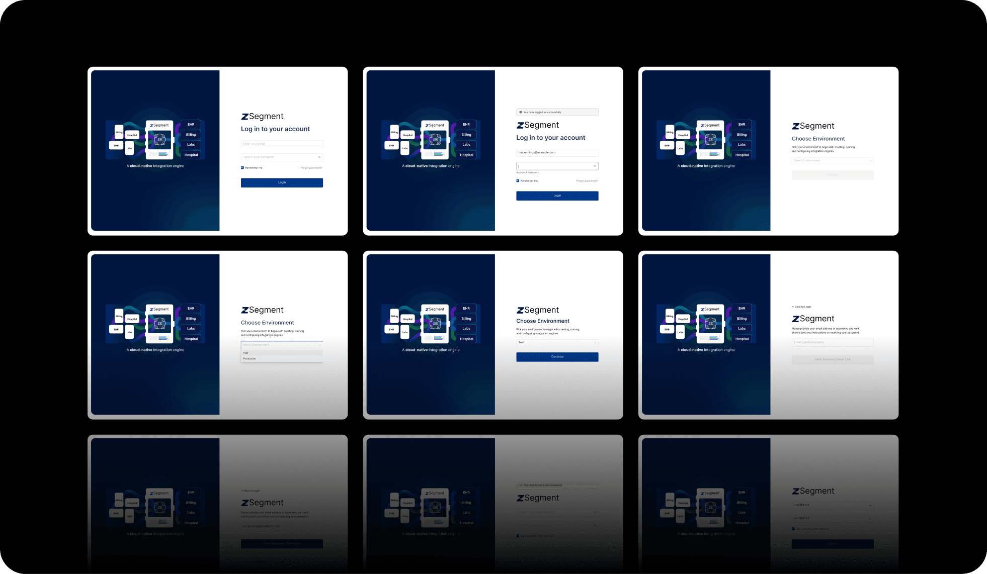
Onboarding screens for new operators
The marketing site, a "ZSegment vs Mirth Connect" comparison page, and a 3D product visual
05 · Impact
In production across 8 health systems
- 8
- Healthcare systems live
- 85%
- Adopted save-view in 2 weeks
- 3x
- Faster to find segments
Live across systems including UTMB (54%), LCMC (17%), SamHealth (10%), and BryanHealth (5%). Across early-2026 support data, the "UX confusion" category of tickets shrank as the redesigns shipped, with the leftover volume shifting toward bugs and feature requests instead of "where do I click?"
06 · Reflection
Design systems compound
One icon or one filter pattern sounds trivial. Multiplied across hundreds of dense screens, that consistency becomes a usability multiplier. I would build the system even earlier next time.
Owning everything from the product UI to the marketing site taught me they reinforce each other: the clarity I designed into the messages module became a literal selling point in the pitch. And "I actually understand the drawer now" validated the work as much as any chart could.