Before the Surprise Bill ArrivesVeritable
Owned a sprawling, multi-audience web product end to end and kept it coherent through a full migration.
- Role
- Web product designer & frontend developer (design to go-live)
- Team
- Abhilash, Vivek (eng), Asha, Satish (CMS)
- Timeline
- 2025 to 2026
- Platform
- Web (Figma, Hugo, Strapi, React)
- 13+
- Page types designed & migrated
- 1 system
- Across every audience
- Live
- Shipped June 2026
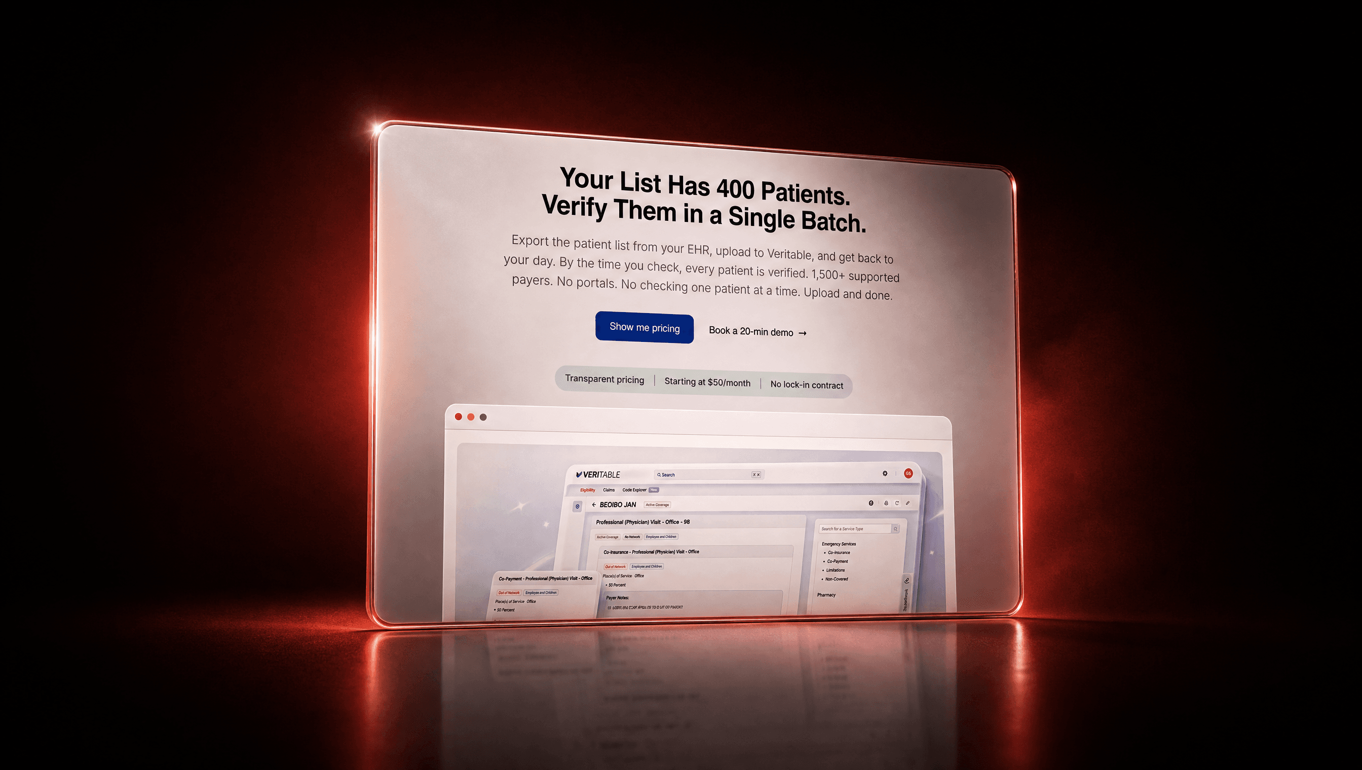
A product that checks your insurance will actually pay before you get hit with a surprise bill. I designed and largely built the whole web experience, treated pricing like a real product, then re-platformed the entire site.
01 · Context & problem
A credible home for a not-very-glamorous job
Veritable needed a website that felt trustworthy and actually moved people to buy. Later it needed a full move to a new platform. That meant juggling pages for two very different audiences, a real pricing-and-checkout flow, and a big pile of content, all without the whole thing drifting into looking like five different sites.
02 · Role & process
Designed it, then built a lot of it
I designed most of the site and built a lot of it myself, then led the migration that followed.
Built the marketing site
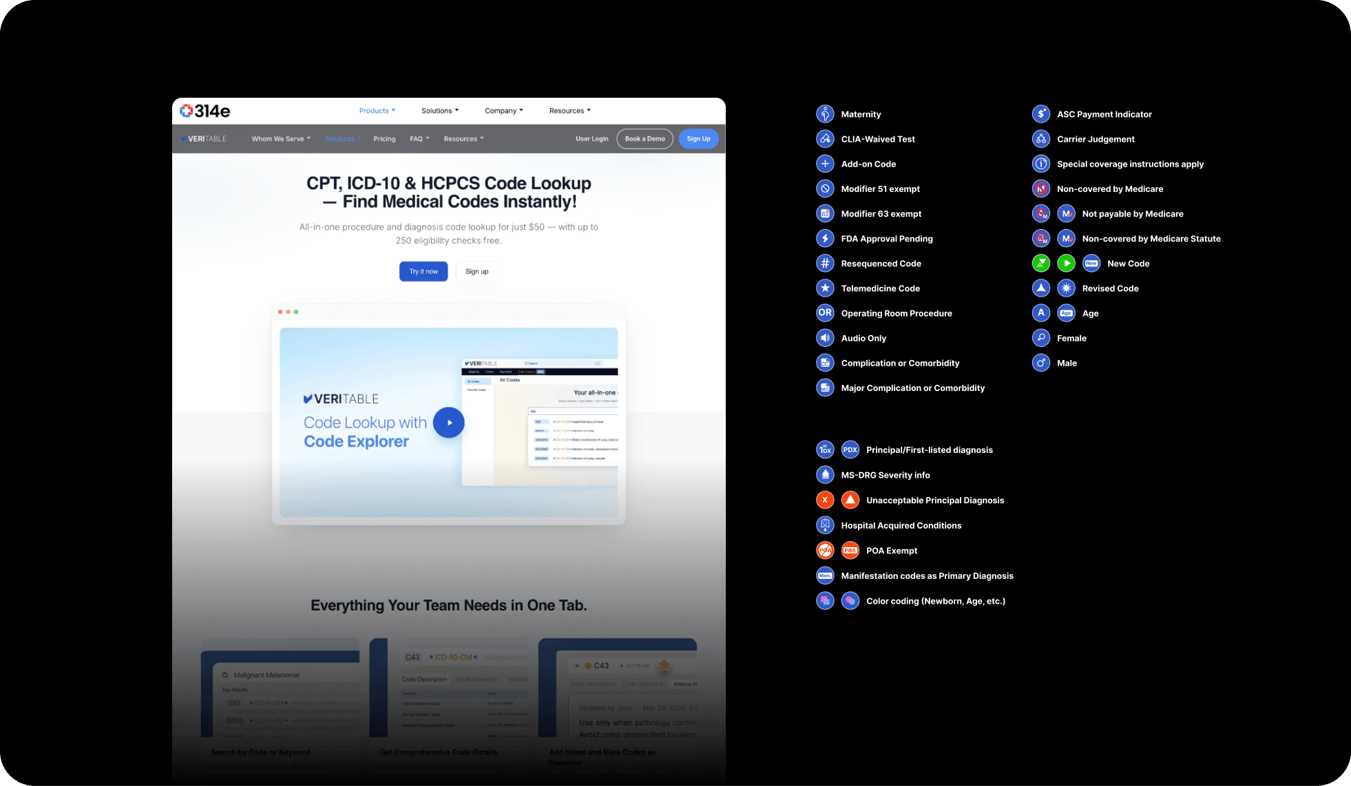
The Code Explorer landing page too: layout, theme, content, and a custom icon set called Veritable Legend.
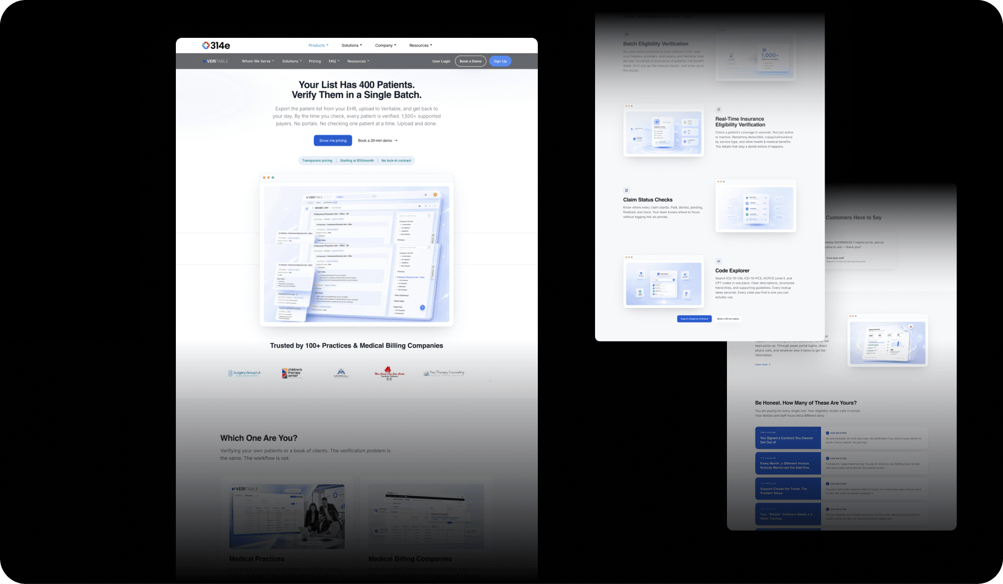
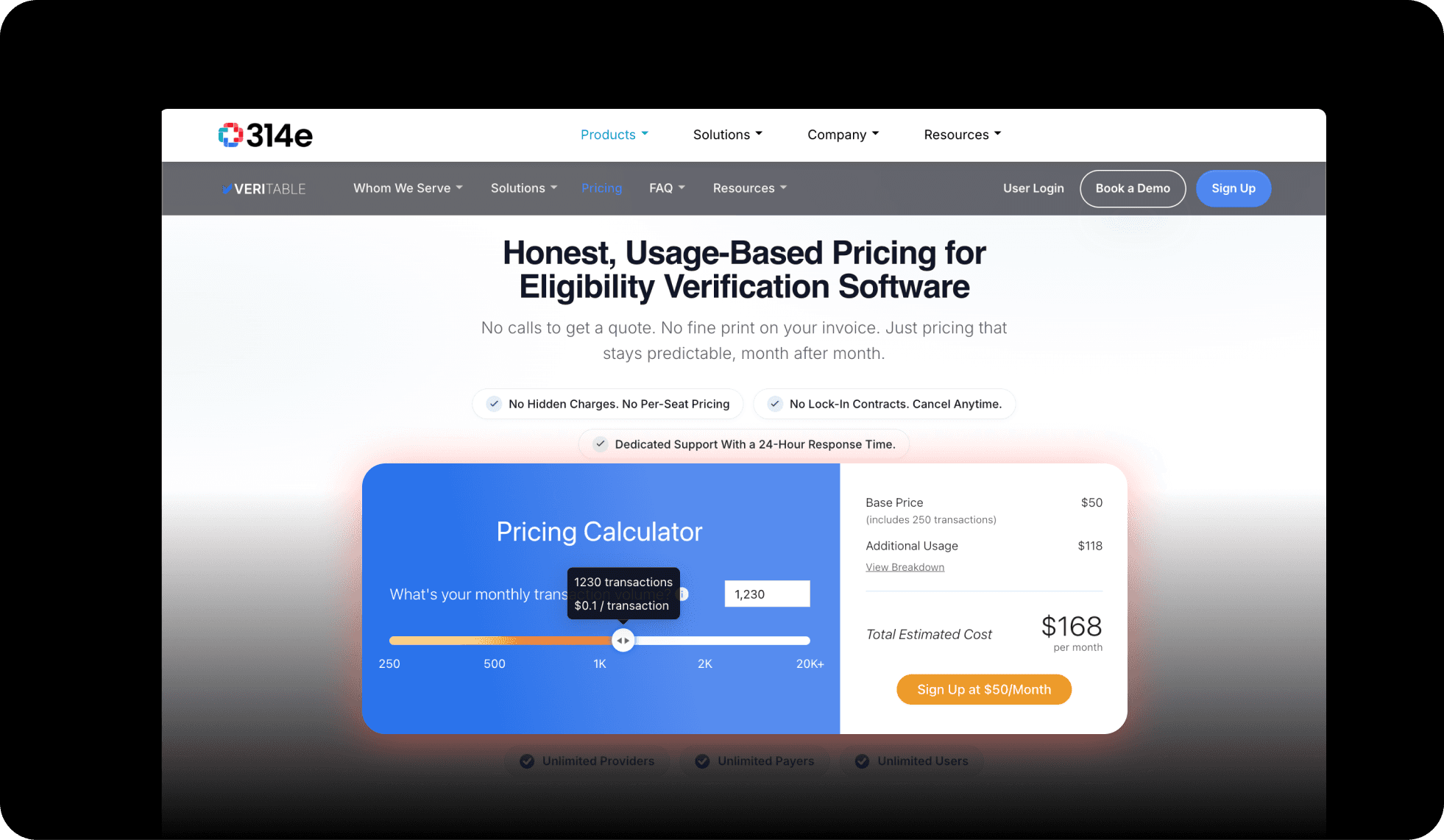
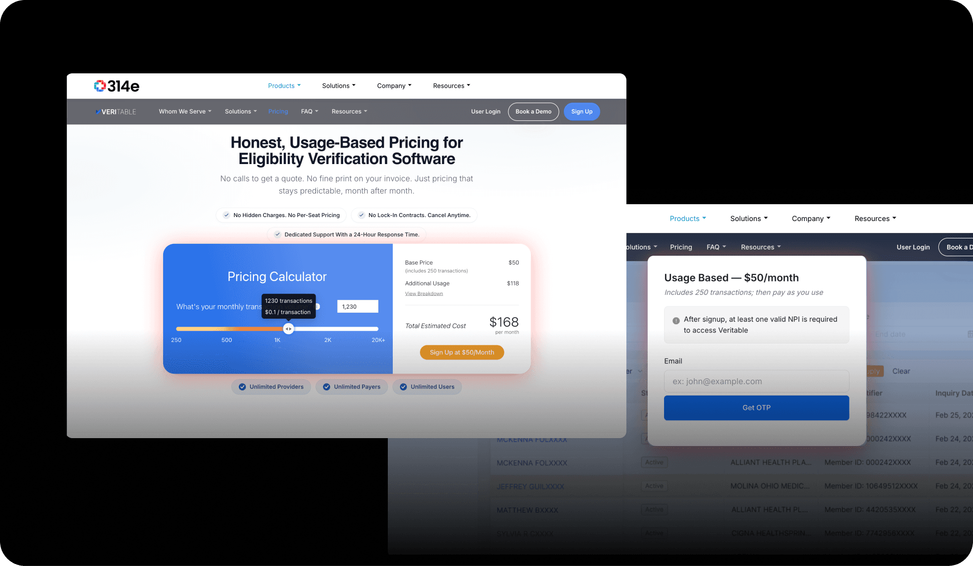
Designed pricing & checkout
A real flow in React, with proper Login and Subscription-Status states.
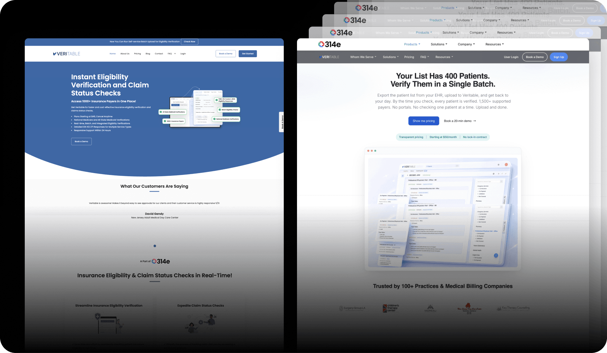
Led the migration
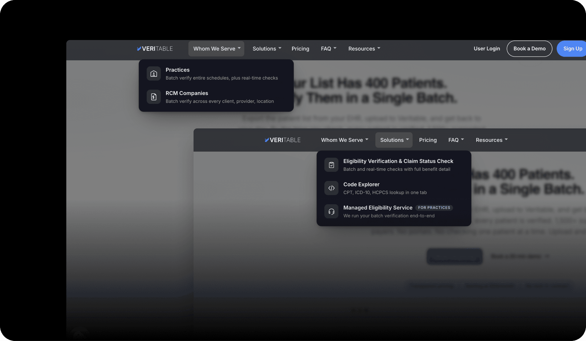
Re-platformed 12+ page types, reworked the header and menus, moved pricing and social images over, produced the product video, and coordinated CMS updates with engineering.
03 · Key decisions
Two decisions that defined the build
Treated pricing as product UX, not a poster
What. Designed a real plan-to-checkout-to-subscription flow in React, not a static price table with a hopeful "contact us" button.
Why. If someone is ready to buy, they should be able to see plans, pick one, pay, and see their status, without going on a scavenger hunt for the buy button.
Tradeoff. A live flow with login and subscription states is far more work than a table.
Result. Checkout is now a designed experience instead of an afterthought.
One visual system across a sprawling site
What. Made one set of icons (Veritable Legend), one theme, and one component set, then applied them across 13+ page types.
Why. Multi-audience sites tend to look like multiple products bolted together. Consistency quietly signals "one company, one promise."
Tradeoff. The system takes time to build up front before it pays off.
Result. Every page reads as one coherent product, even though they speak to different people.
04 · Solution & artifacts
What shipped
The marketing site (layout, theme, content)
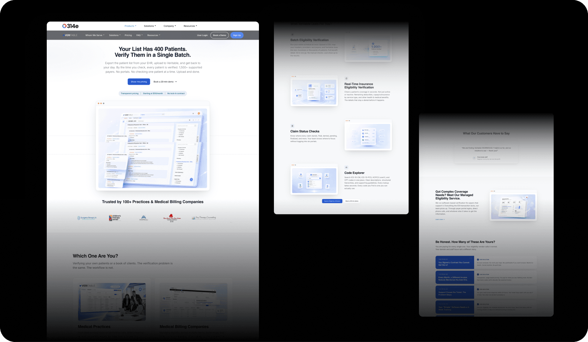
The Code Explorer landing page with a custom icon set
Audience-specific pages (For Practices, For RCM Companies, Eligibility Verification, Code Explorer, Managed Service, a long-form software page, an anchored FAQ)
A pricing and checkout flow (plans, checkout, login, subscription status)
A full re-platforming of 12+ page types
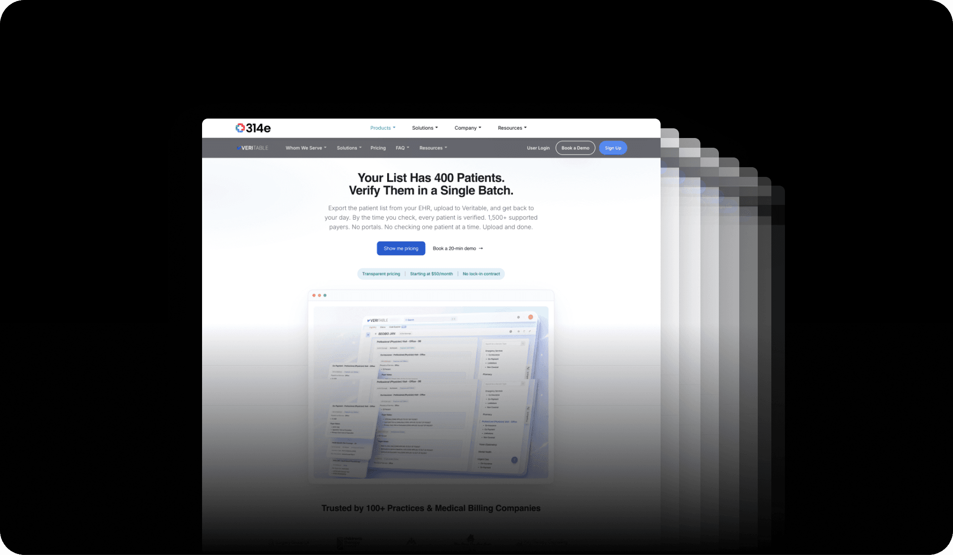
A header and menu redesign
The product video and thumbnails
An ad system (GIF and AI-generated video ads in 16:9, 9:16, and 4:5, with sound design)
05 · Impact
Live, with conversion tracking next
- 13+
- Page types designed & migrated
- 1 system
- Across every audience
- June 2026
- Went live
The site went live in June 2026, so conversion numbers are still coming in. What is solid today: 13+ page types redesigned and migrated, one consistent visual system across all of them, a real checkout flow, and a multi-format ad system. Tracking conversion is the next chapter.
06 · Reflection
Owning a web product end to end
Veritable is my clearest example of owning a web product from blank page to go-live: the visual system, the information architecture, a working checkout, and the frontend build. Keeping a big, multi-audience site coherent through a full migration taught me how to scale design thinking without letting it fray at the edges.