When One Product Becomes Three BrandsJeeves Brand System
One cohesive Jeeves across every surface, and faster production because reusing beats reinventing.
- Role
- Brand & Design Systems Designer
- Team
- Abhilash, Asha, Julie, Marketing
- Timeline
- 2023 to 2026 (ongoing)
- Platform
- Design system (Figma, Canva)
- 40+
- Custom icons
- 15+
- Tutorials on one system
- 6
- Application contexts
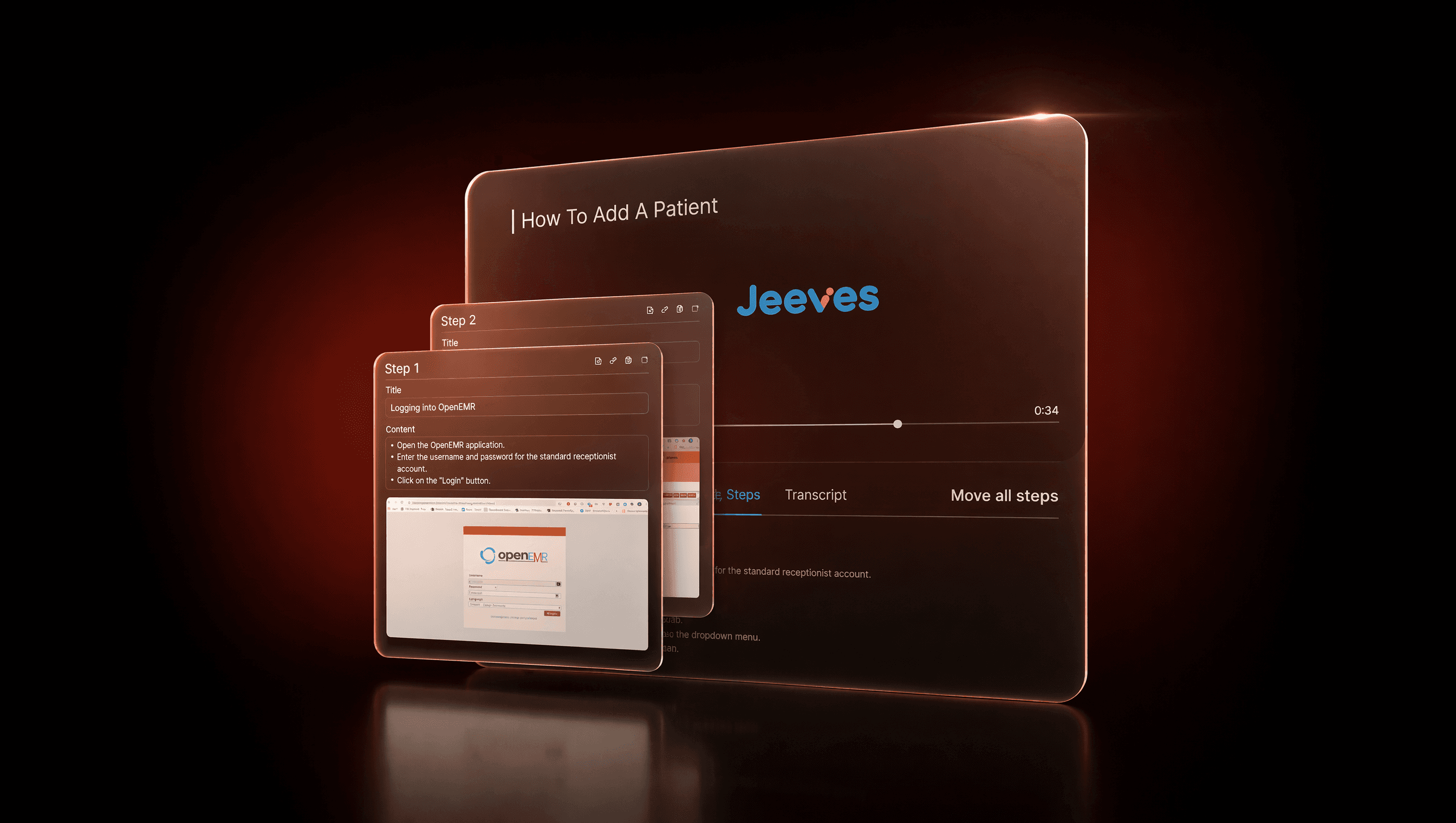
Jeeves was quietly turning into three different brands depending on where you looked. I built one rulebook so the product, the website, the videos, and the slides finally felt like the same thing.
01 · Context & problem
One product wearing three different outfits
Jeeves shows up everywhere: in-product help videos, the marketing site, sales decks, customer-story pages, release notes, LinkedIn posts, even printed handouts. When I started, each one had its own idea of the brand. The colors drifted, the fonts disagreed, the logo had several haircuts, and the tutorial videos all paced differently.
The mess cost twice. It blurred the brand (the video, the website, and the deck felt like three companies), and it slowed everyone down, because nobody could reuse anything.
02 · Role & process
Own the whole rulebook
I owned all of it: logo, color, typography, icons, components, motion, and the rules for using them everywhere.
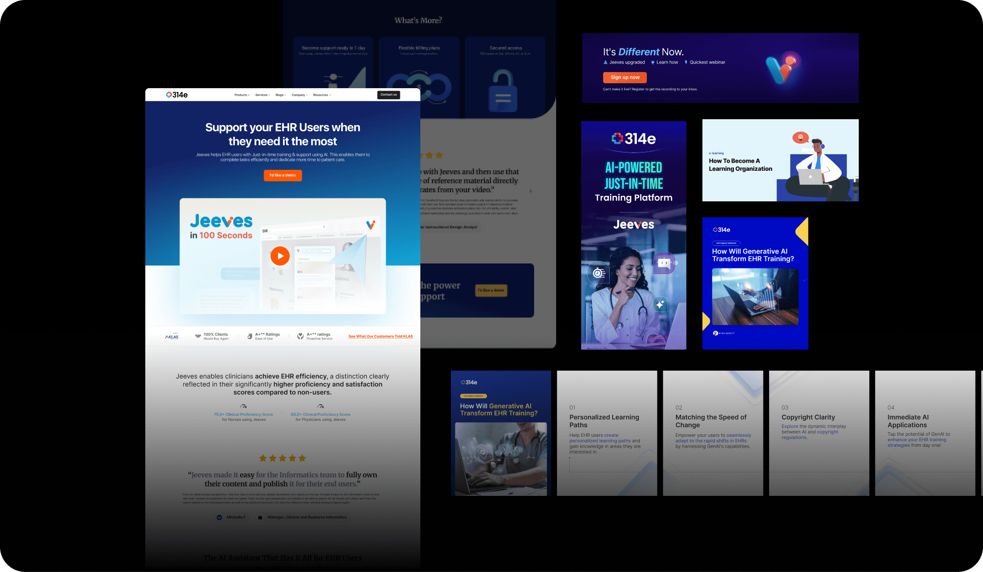
Audit
Every existing Jeeves asset across product, web, video, and marketing.
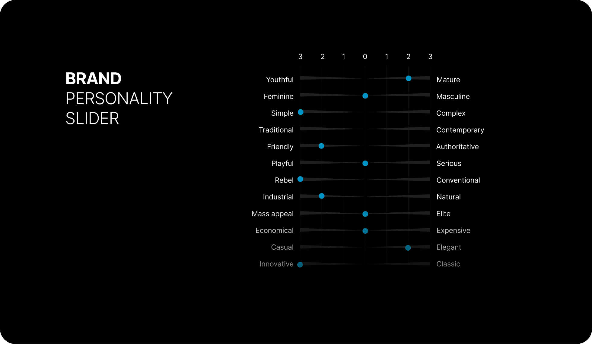
Research
The positioning: in-product training for clinicians, with ease of use as the edge.
System design
One coherent visual language.
Documentation
Clear rules, examples, and do's and don'ts.
Application
Across product UI, the website, videos, and decks.
Iteration
As new features and channels appeared.
03 · Key decisions
Decisions that made the system hold
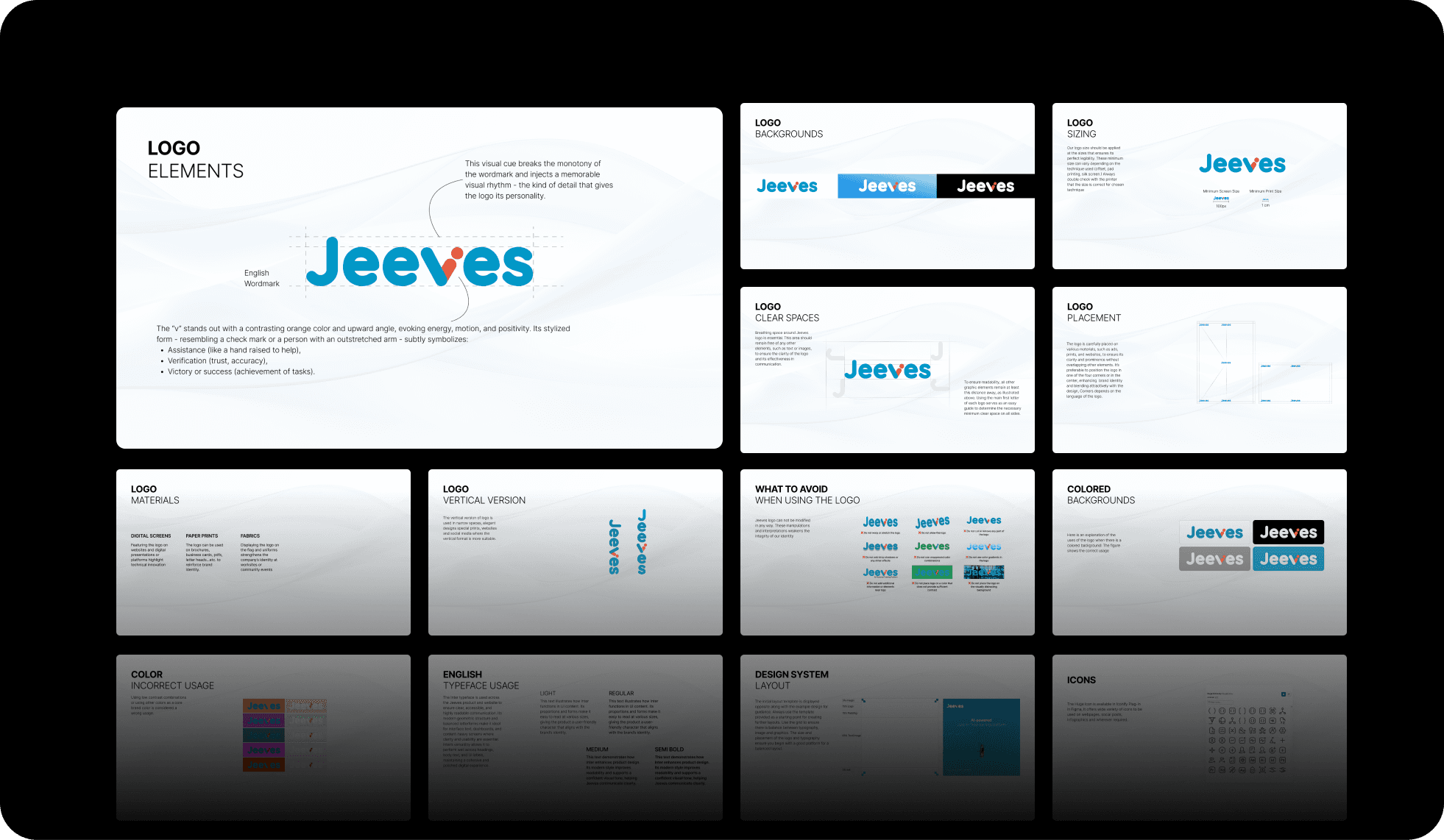
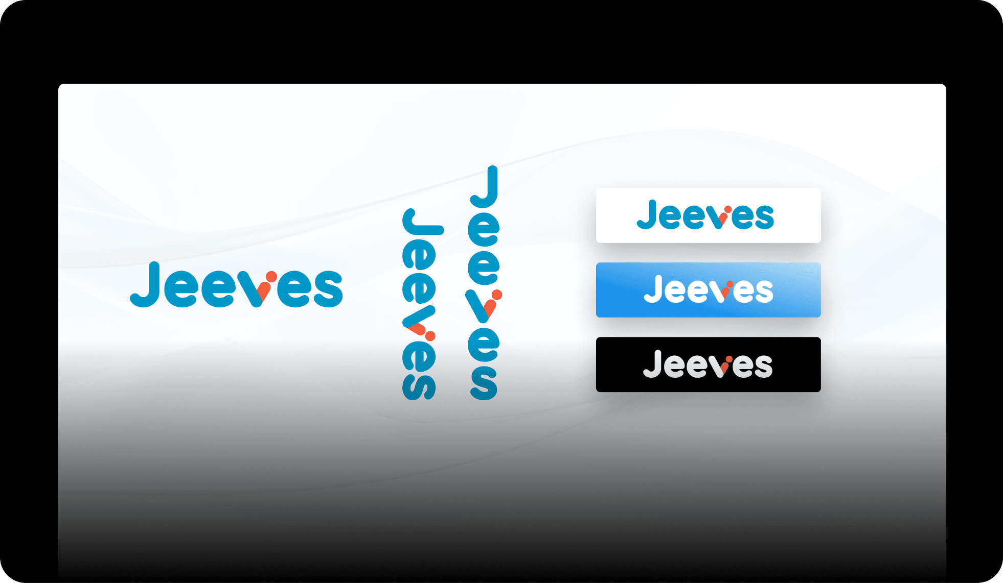
A logo system, not a single logo
What. Three variants (full wordmark plus mark, mark only, monochrome) with rules for spacing and minimum size.
Why. Jeeves needs to look right on a homepage and in a tiny browser-tab icon and on a one-color print job. No single logo survives all three; a system does.
Tradeoff. A system takes more documenting and more discipline to maintain than one file.
Result. The logo works confidently everywhere because people follow rules instead of guessing.
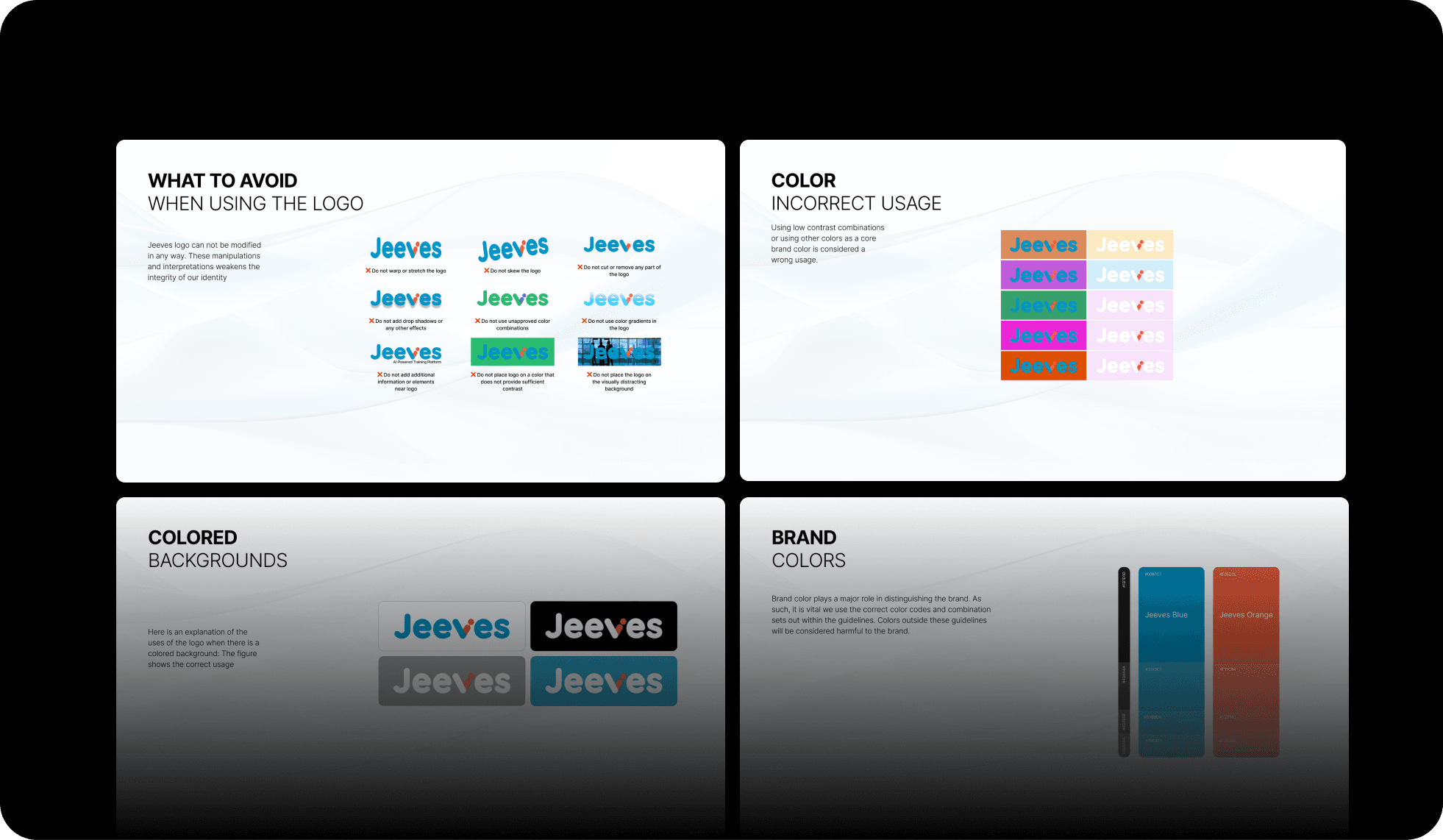
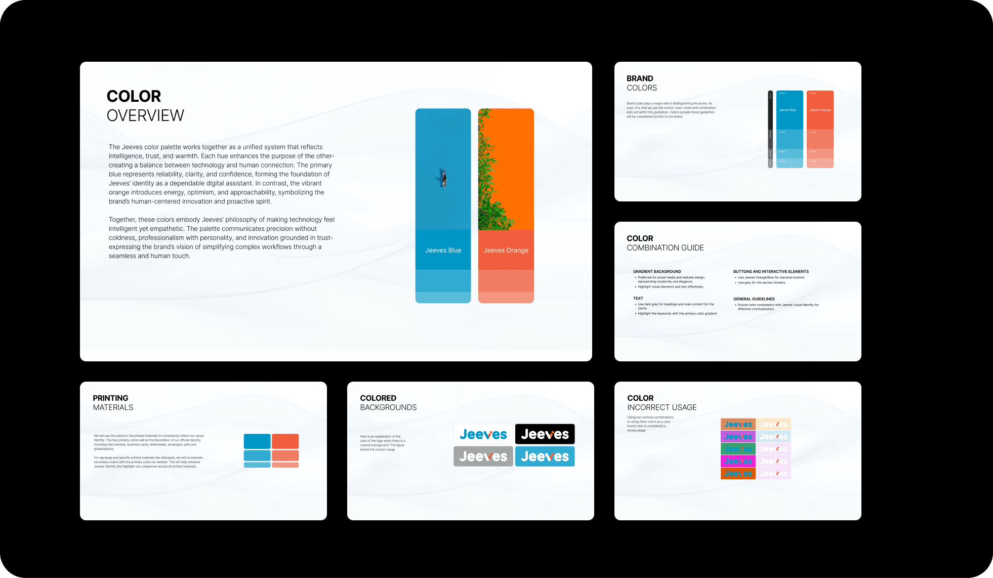
A color palette built for healthcare
What. Five meaningful colors plus neutrals, each with a job (brand blue, success green, warning orange, error red, info purple), all readable to the standard and safe for colorblind users.
Why. In data-dense medical screens, color carries meaning, so the palette has to be deliberate and legible, not decorative.
Tradeoff. Five plus neutrals means fewer options, but consistency is the whole point.
Result. Every screen, thumbnail, and graphic shares the same palette, and customers recognize Jeeves on sight.
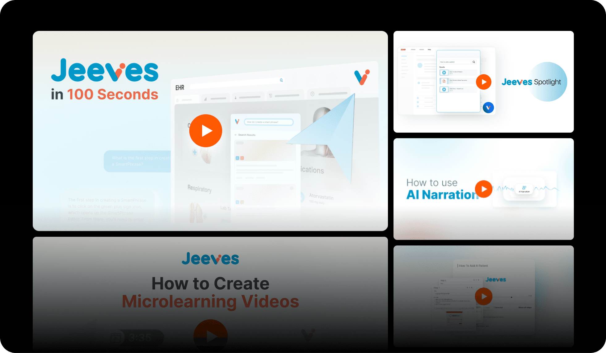
One motion language for the videos
What. Standardized the easing, timing, and durations across all 15+ tutorial videos.
Why. Motion is part of a brand's personality. When one video is snappy and the next is sluggish, they feel like different products. Matching the motion makes the whole library feel like one helpful voice.
Tradeoff. Everyone making videos has to follow the same rules.
Result. The tutorial library reads as a single, cohesive help system.
04 · Solution & artifacts
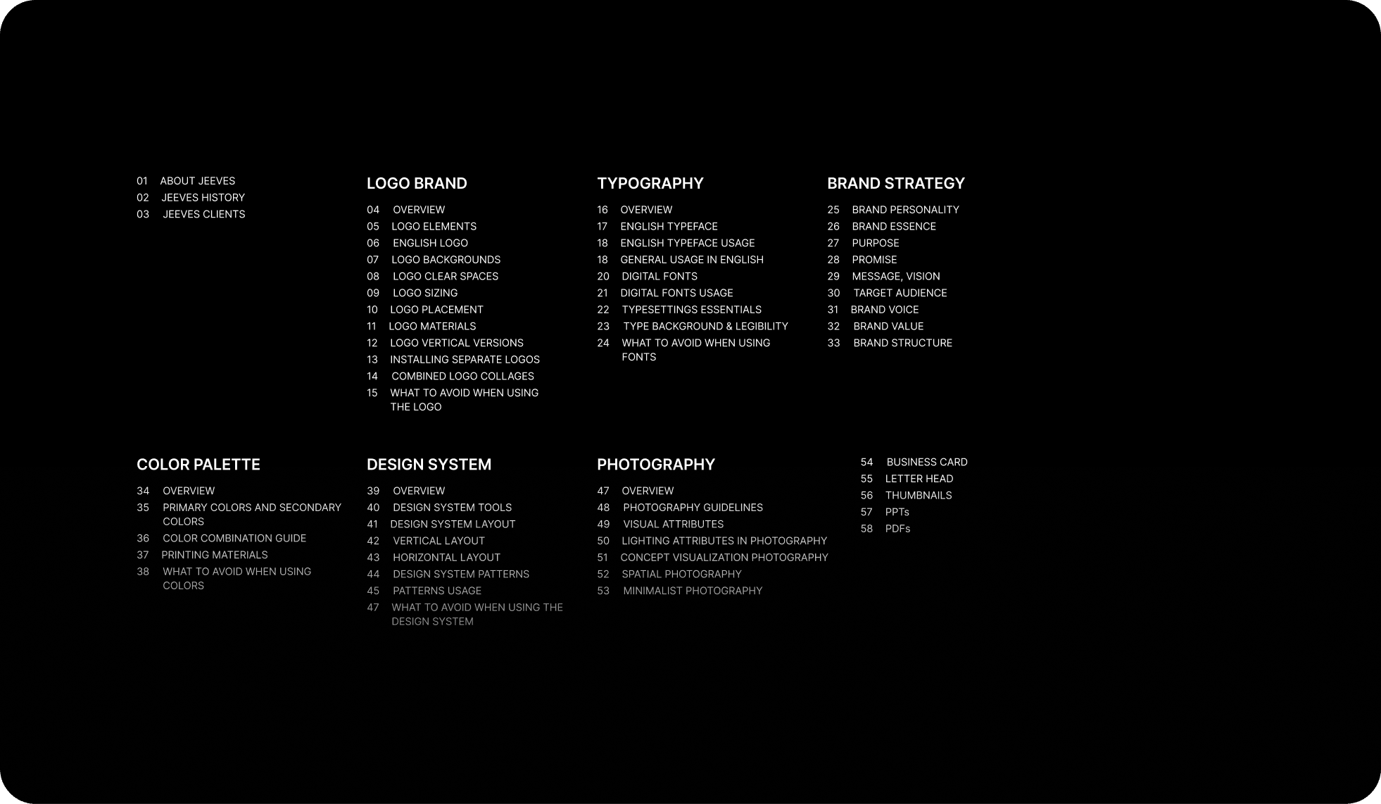
What the system documents
Logo system: three variants, clear space, minimum sizes, do's and don'ts
Color: five semantic colors plus neutrals, accessible, with colorblind-safe alternates
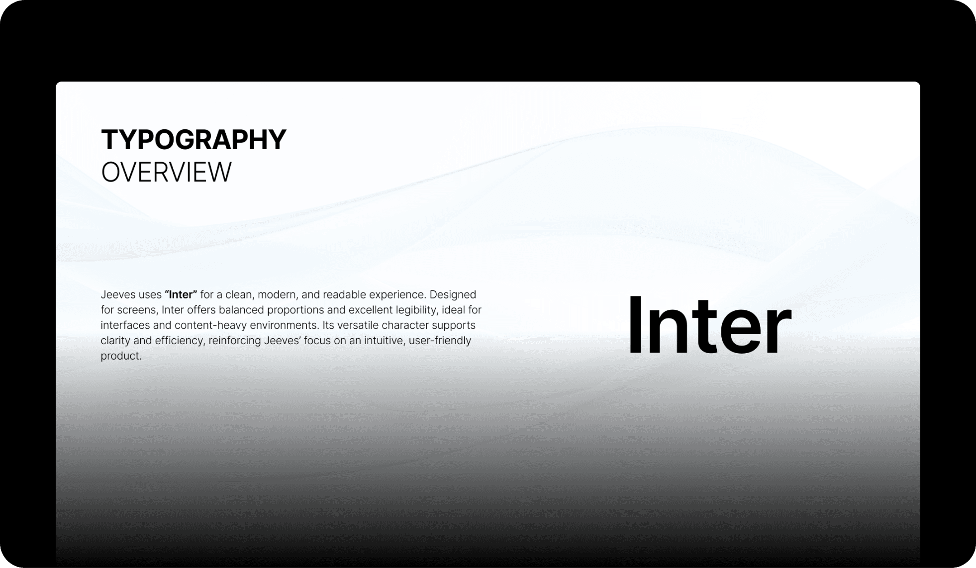
Typography: Inter, a five-step size scale, four weights, with clear usage rules
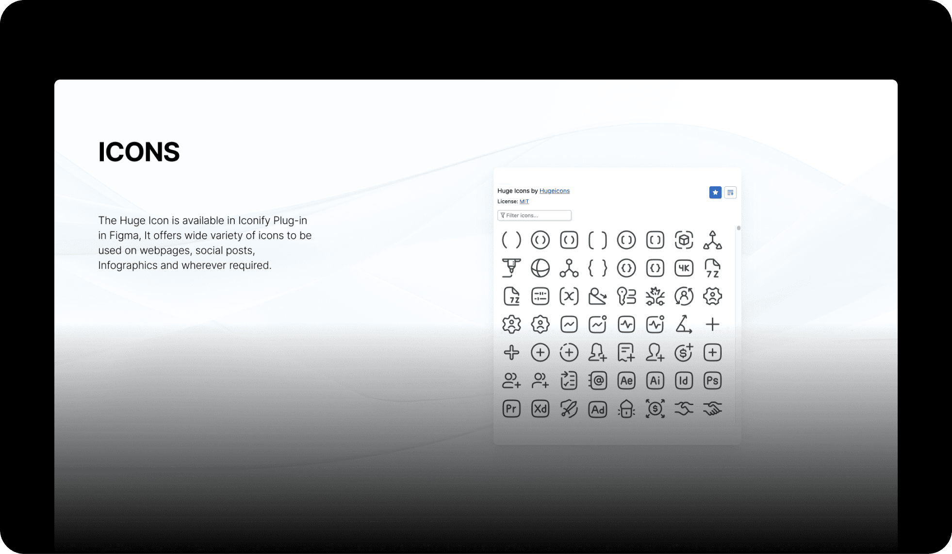
Icons: 40+ custom icons (consistent stroke and size) plus rules for new ones
Components: buttons, cards, inputs, alerts, each documented with their states
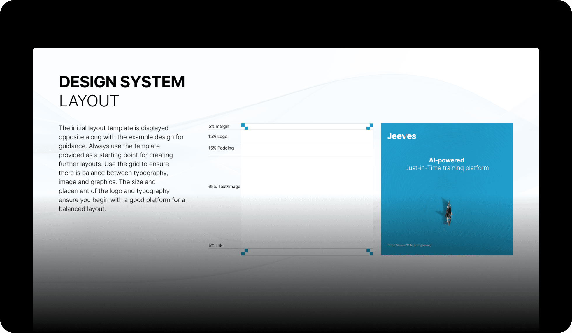
Motion: standard easing and durations for micro, UI, and larger transitions
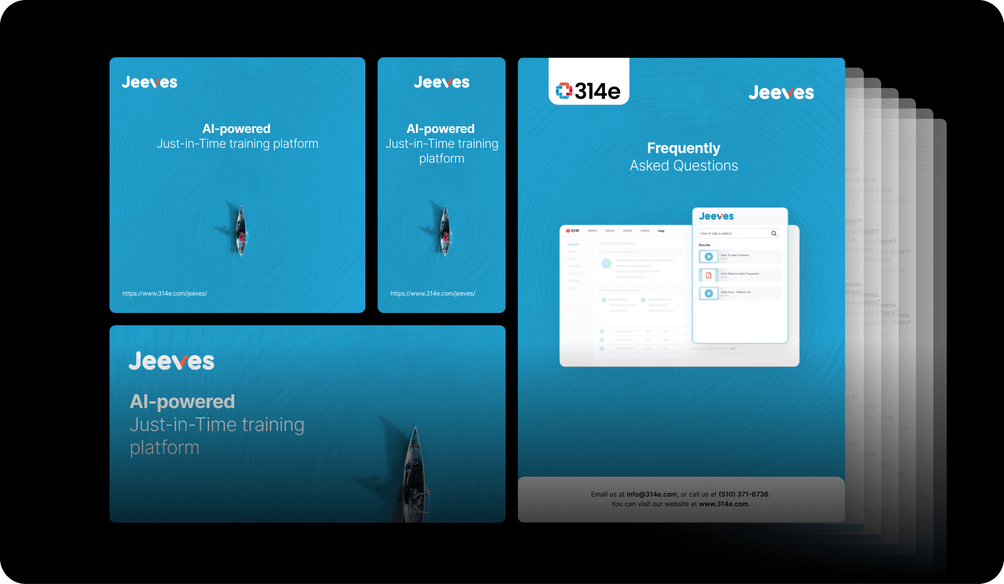
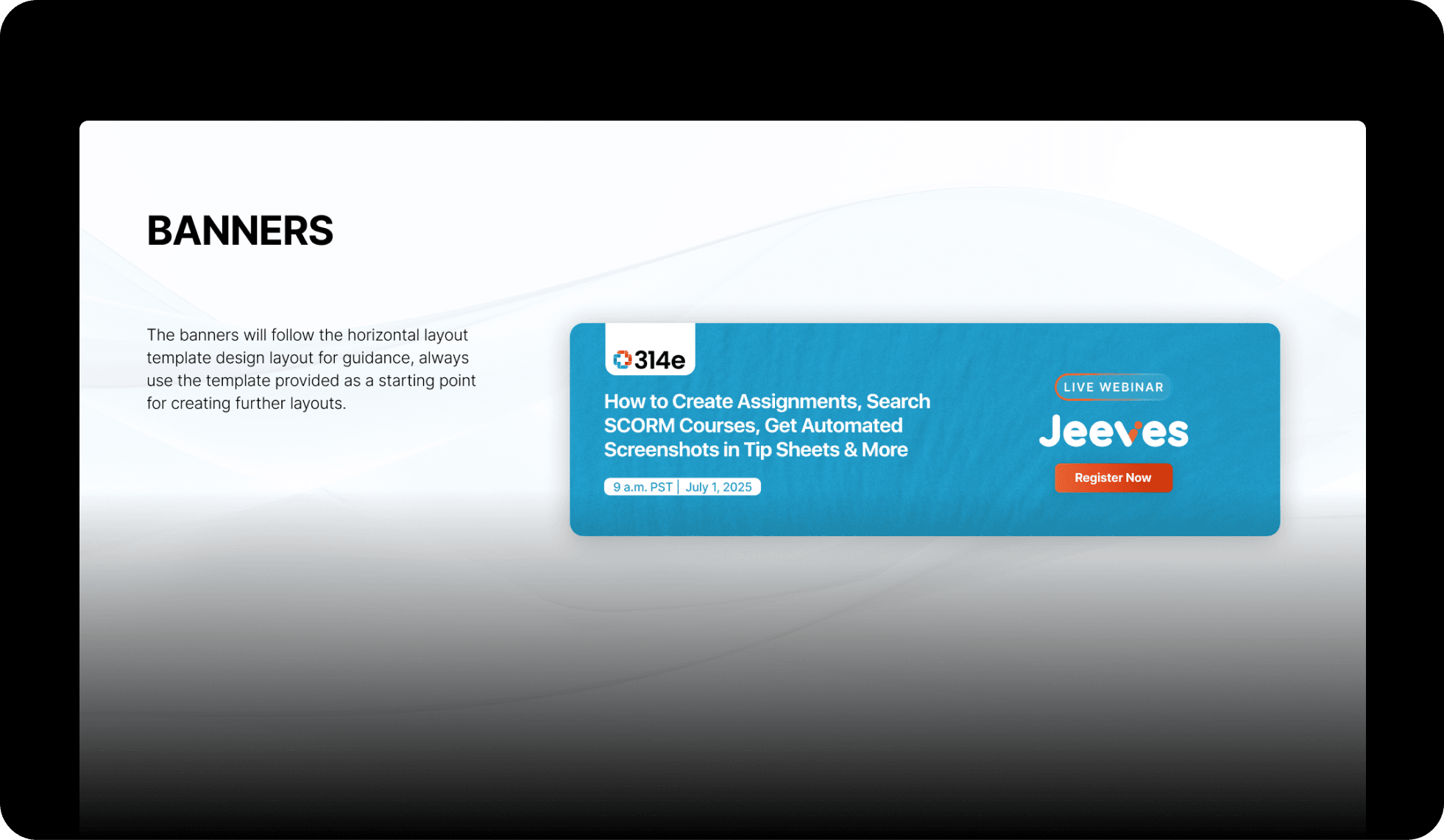
Application guides: product, web, video, print, social, and collateral
05 · Impact
One brand, every surface
- 40+
- Custom icons
- 15+
- Tutorials on one system
- 6
- Application contexts
In practice: 15+ help videos built on the guidelines, customer-story pages using the brand colors and type, every sales deck following the system, and a fully branded marketing site. Designers ship faster because the standard option beats starting from a blank page, and customers recognize Jeeves wherever it shows up.
06 · Reflection
Consistency is a multiplier
One blue, repeated across 15 videos, a website, a product, and a stack of marketing, builds a recognition no single gorgeous design could. Design systems are living things: strict enough to stay coherent, loose enough to grow. And a rulebook only matters if people actually open it, which happens when following it is easier than ignoring it. Next time I would pull in engineers and marketers earlier, because co-writing the rules is what makes people follow them.