Great Screen, No Way to Find ItRagam Theatre App
A complete booking-app concept and clickable prototype for a real local theatre, built as a college project rather than a shipped product.
- Role
- UI Designer (visual design & prototyping)
- Team
- 6-person student team
- Timeline
- 2021 to 2022
- Platform
- Mobile app concept (Figma, prototype)
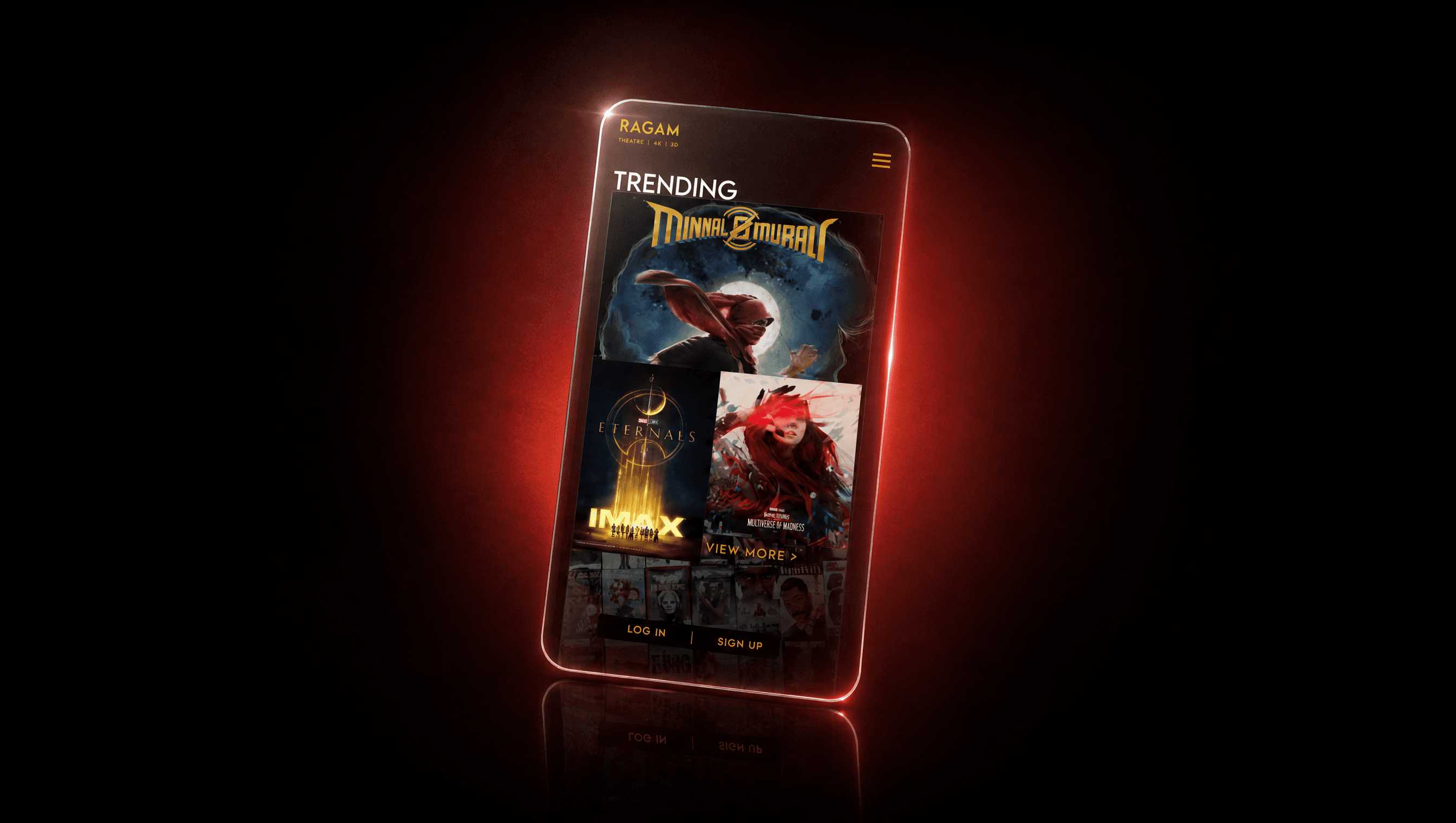
Ragam Theatre had real 4K and 3D screens in Kerala and no digital presence at all. As a 6-person college team I led UI design and prototyping on a booking app that gave it a proper digital front door: browse, trailer, format, seat, done.
01 · Context & problem
A 4K screen nobody could find online
Ragam Theatre runs real screens in Parassinikadavu and Thrissur, Kerala, including 4K and 3D formats that plenty of bigger multiplexes still don't have. What it didn't have was any digital presence: no app, no easy way to check what was playing, and no path from "I want to watch a movie tonight" to an actual seat.
So the brief became a straightforward booking app: browse what's on, watch a trailer, pick a date, time, and format, and book a seat, the convenience people already expect from the bigger chains.
02 · Role & process
Six of us, my focus was the UI and the prototype
Research, flows, wireframes, UI, and dev were split across a six-person team. My part was the visual design and the interactive prototype, built on top of the flows and low-fidelity wireframes the group agreed on together.
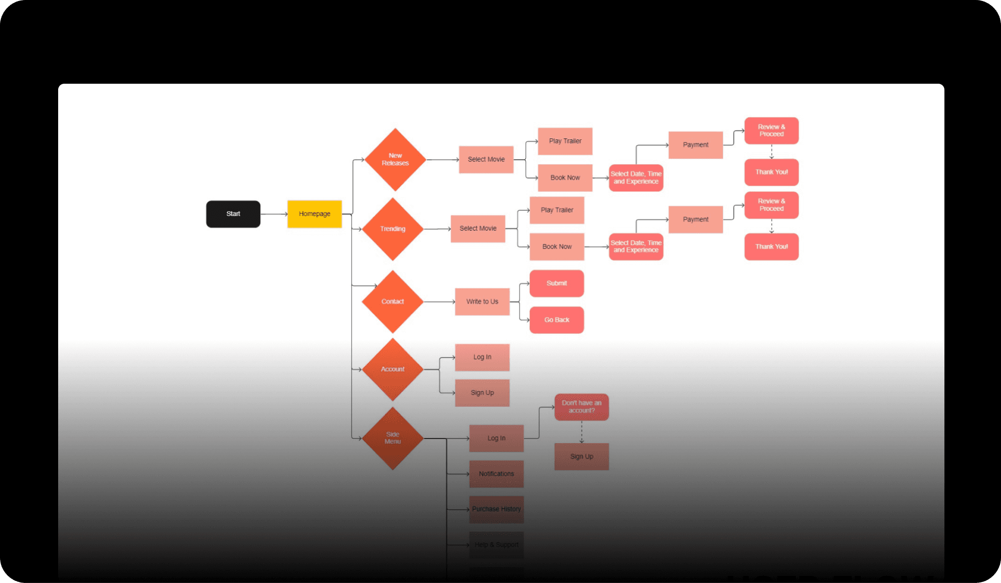
Mapped the user flows
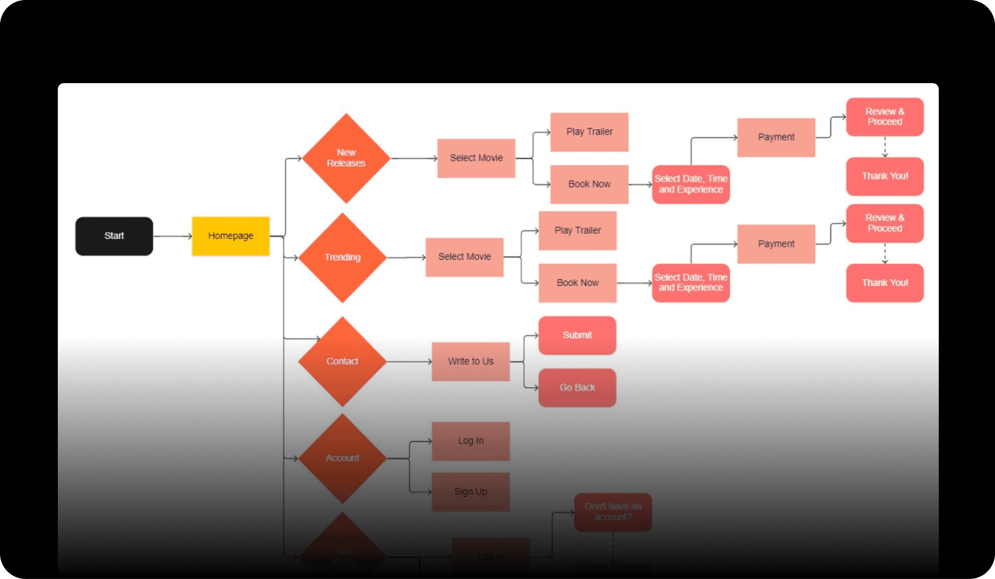
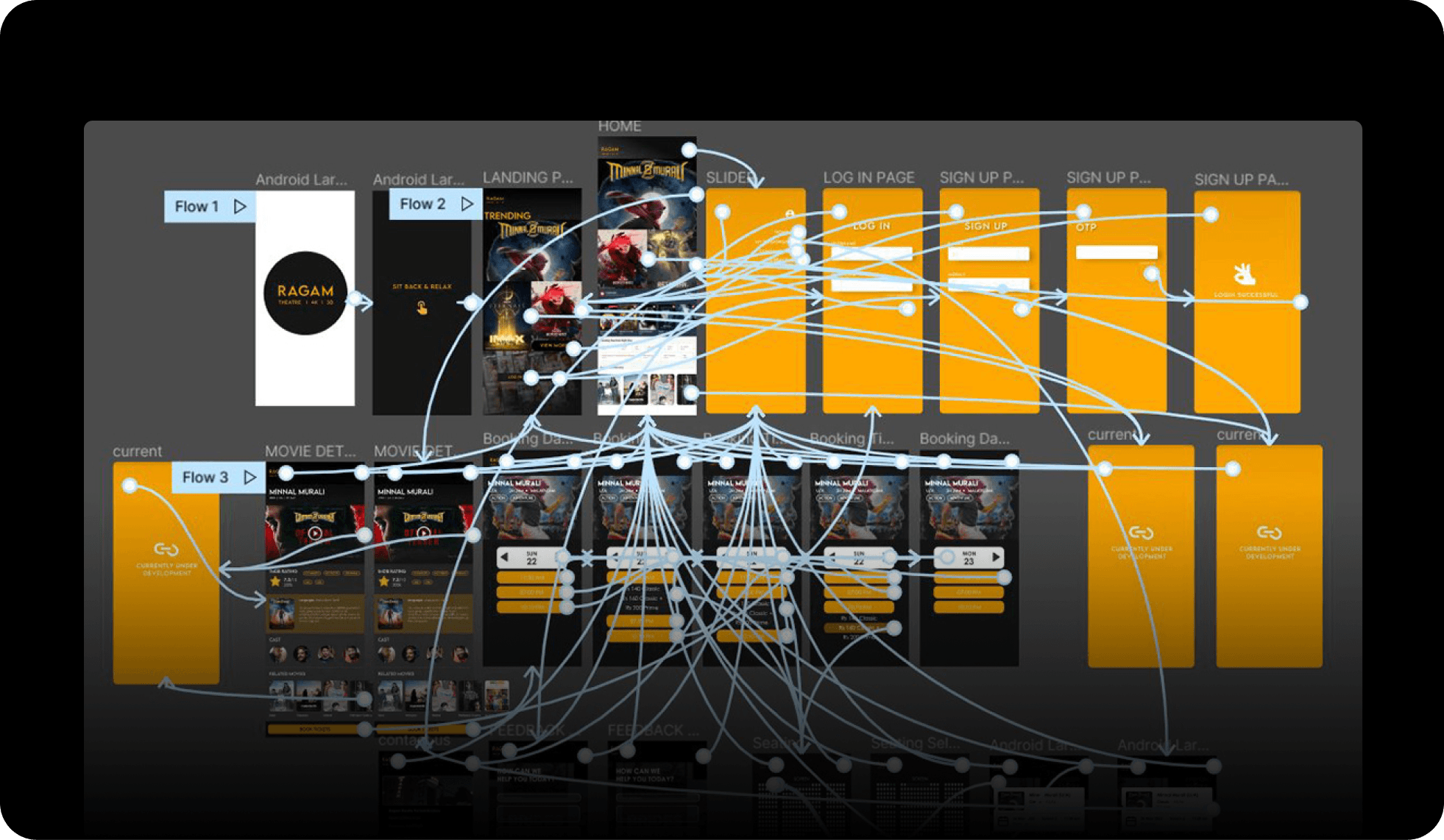
Homepage branching into New Releases, Trending, Contact, Account, and the side menu, each traced through to payment and a Thank You screen.
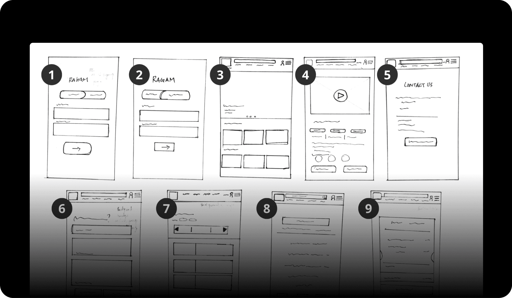
Sketched the screens
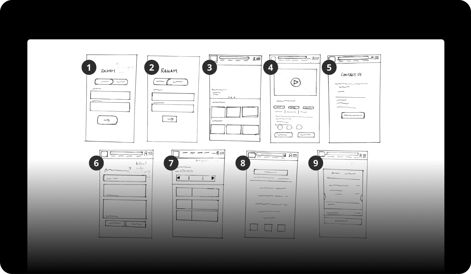
Nine screens on paper first: onboarding, browse, movie details, contact, feedback, and booking.
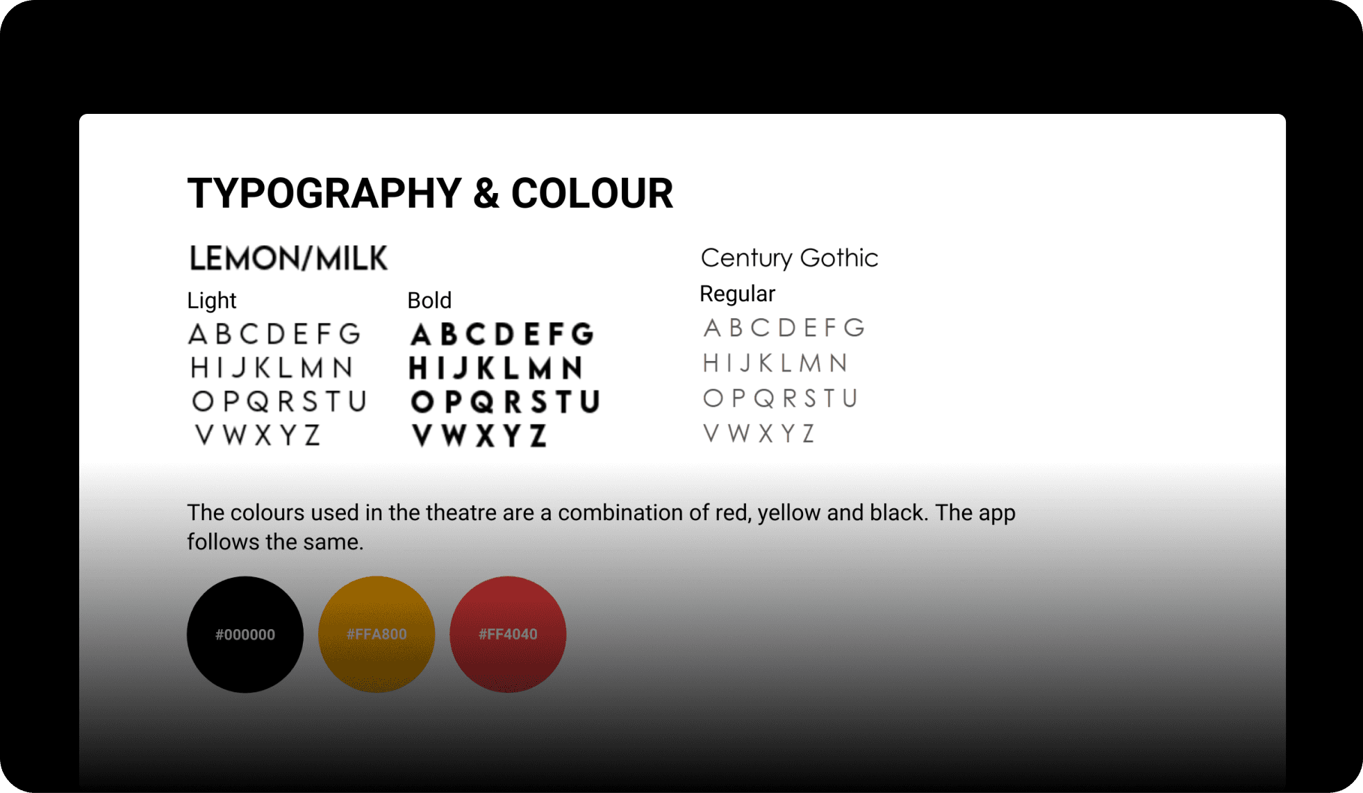
Set the type and colour system
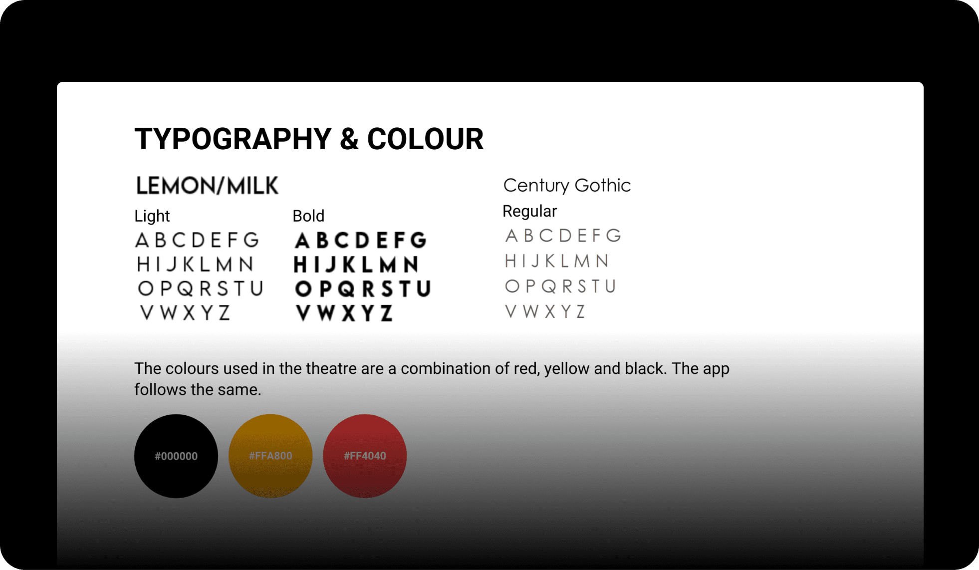
Lemon/Milk and Century Gothic, paired with the theatre's own black, orange, and red.
Built the wireframes
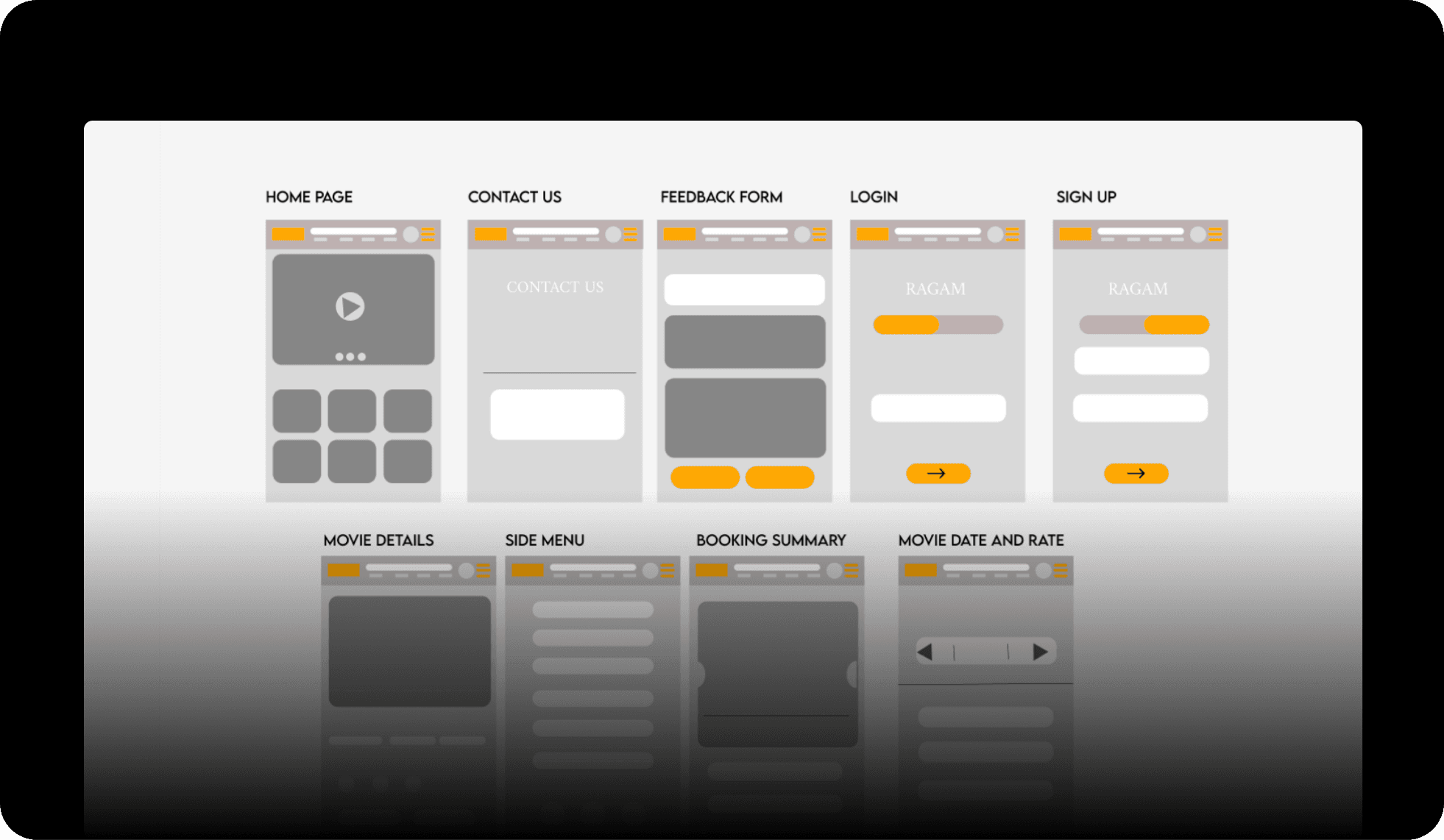
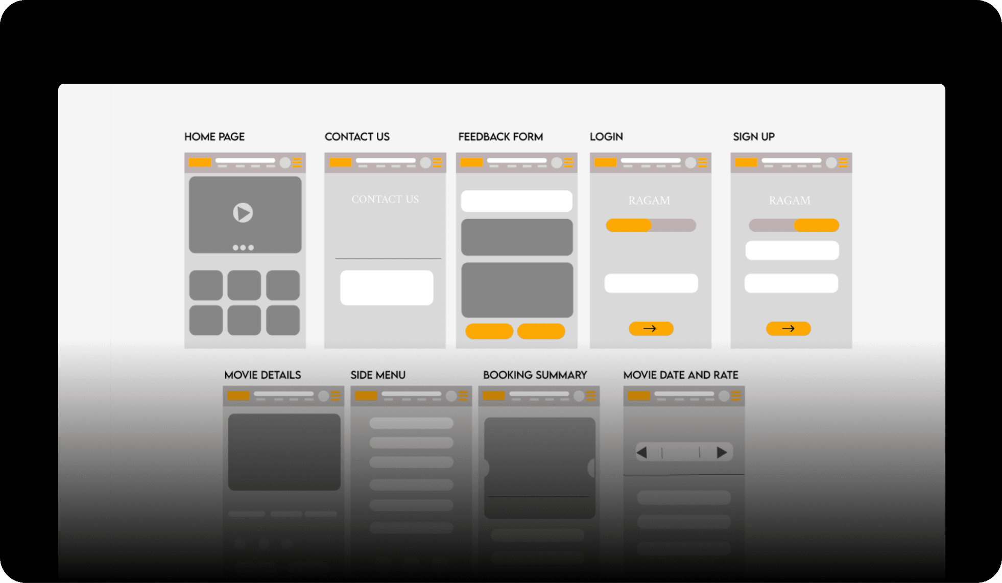
Greyscale versions of every core screen, home, login, sign up, movie details, side menu, booking summary, before touching colour.
Designed the UI and wired the prototype
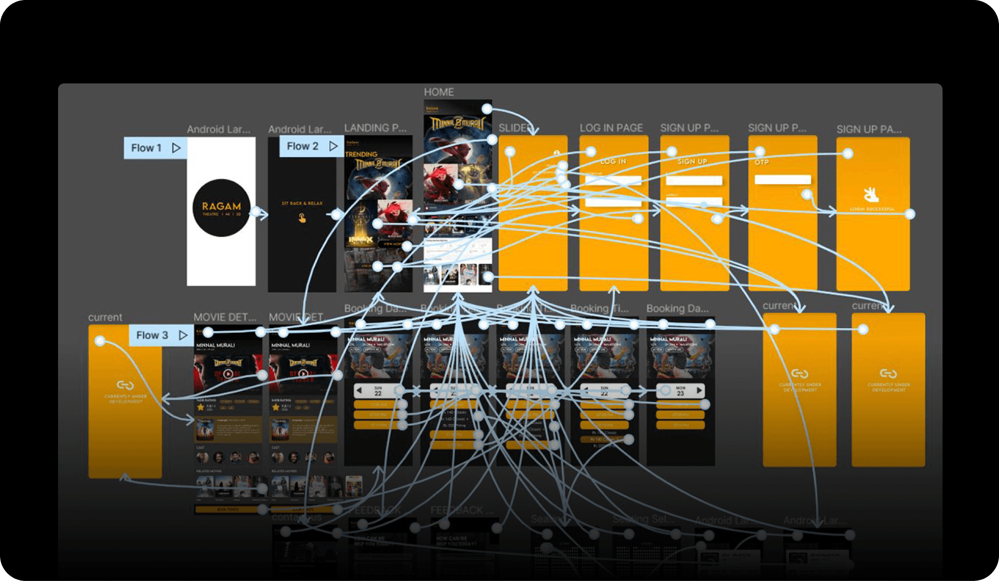
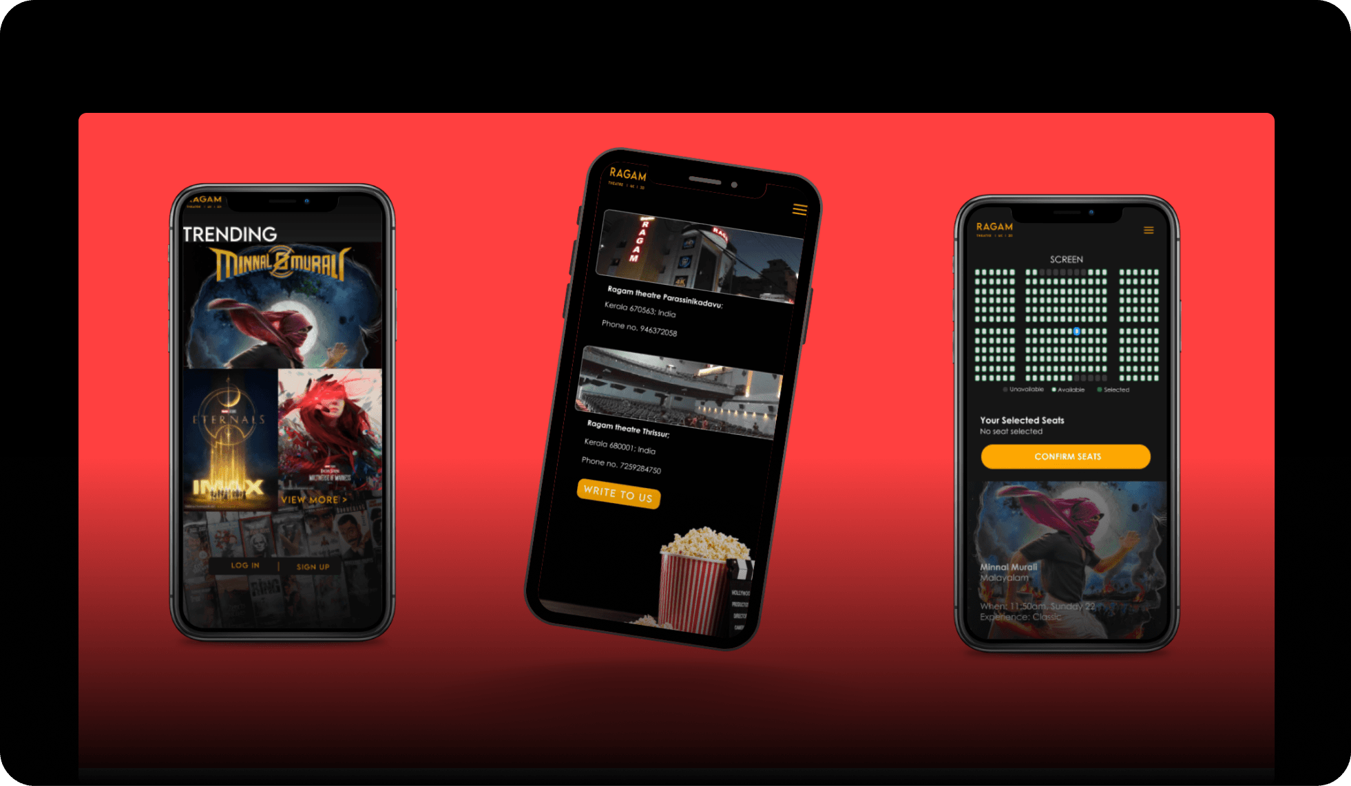
The part I owned: the final screens (trending, seat map, contact) and a clickable Figma prototype across three flows.
03 · Key decisions
Three decisions grounded in a real place
Borrowed the theatre's own identity
What. Pulled straight from Ragam's existing look: the black, orange, and red already on its signage, paired with Lemon/Milk and Century Gothic.
Why. A local theatre doesn't need a brand-new identity to feel legitimate online, it needs to feel like itself. Reusing what people already recognize made the app instantly familiar instead of generic.
Tradeoff. Less room to invent a flashy new identity for the coursework, more constraint-driven than free-form.
Result. The screens read as clearly Ragam's, not a template any ticketing app could have used.
Format and showtime, not just the movie
What. The booking flow has a dedicated "select date, time, and experience" step, where experience means Classic, 4K, or 3D.
Why. 4K and 3D are Ragam's actual edge over plainer local screens. Burying that choice inside a generic seat picker would waste the one thing worth a special trip.
Tradeoff. One extra decision point before payment.
Result. The format the theatre is proud of becomes a visible, tappable choice, not a footnote.
Contact info as the real answer, not a form
What. The Contact Us screen leads with the actual addresses (Parassinikadavu and Thrissur) and phone numbers. A "Write to us" form sits below that, not instead of it.
Why. The whole brief was visibility. If someone opens the app just to find out where the theatre is or call ahead, making them fill out a form first would defeat the point.
Tradeoff. Less "product-y," more like a local business card, on purpose.
Result. Anyone unsure whether Ragam is nearby gets the answer in one tap, no typing required.
04 · Solution & artifacts
What the team shipped
A full user-flow map across discovery, booking, account, and support
Nine hand-sketched wireframes covering onboarding through booking
A greyscale wireframe pass for every core screen
A type and colour system built on Ragam's existing palette and two paired typefaces
High-fidelity UI for the core screens (trending, movie details, seat selection, contact)
A clickable Figma prototype across three flows: onboarding, the landing experience, and end-to-end movie booking
05 · Impact
A complete prototype, not a shipped product
This was a college project. The final deliverable was a full UI system and a three-flow clickable prototype, not a published app, and Ragam Theatre never saw real usage numbers from it. What it did prove out, for the six of us and for me specifically on the UI and prototyping side, was a complete, coherent booking experience built around a real business with real constraints, instead of a hypothetical brief.
06 · Reflection
Designing inside someone else's identity
Working from Ragam's actual colours and fonts instead of inventing a new identity was a useful constraint. It's easy to make a portfolio piece that looks impressive and generic, harder, and more useful, to make one thing feel like it belongs to a specific, real place. Splitting the work six ways also meant my job wasn't the whole product, it was making the flows the group agreed on feel real: the UI and a prototype someone could actually click through. That focus, owning one discipline well inside a team rather than touching everything shallowly, is something I'd carry into any team project since.