When the Brief Is Just CuriosityMockups & Coldplay Prints
A sharper eye for realistic mockup lighting and material, and a small, finished set of typography-led tee designs.
- Role
- Self-directed: mockup design, typography, print design
- Timeline
- 2024, self-directed
- Platform
- Product mockups, apparel prints
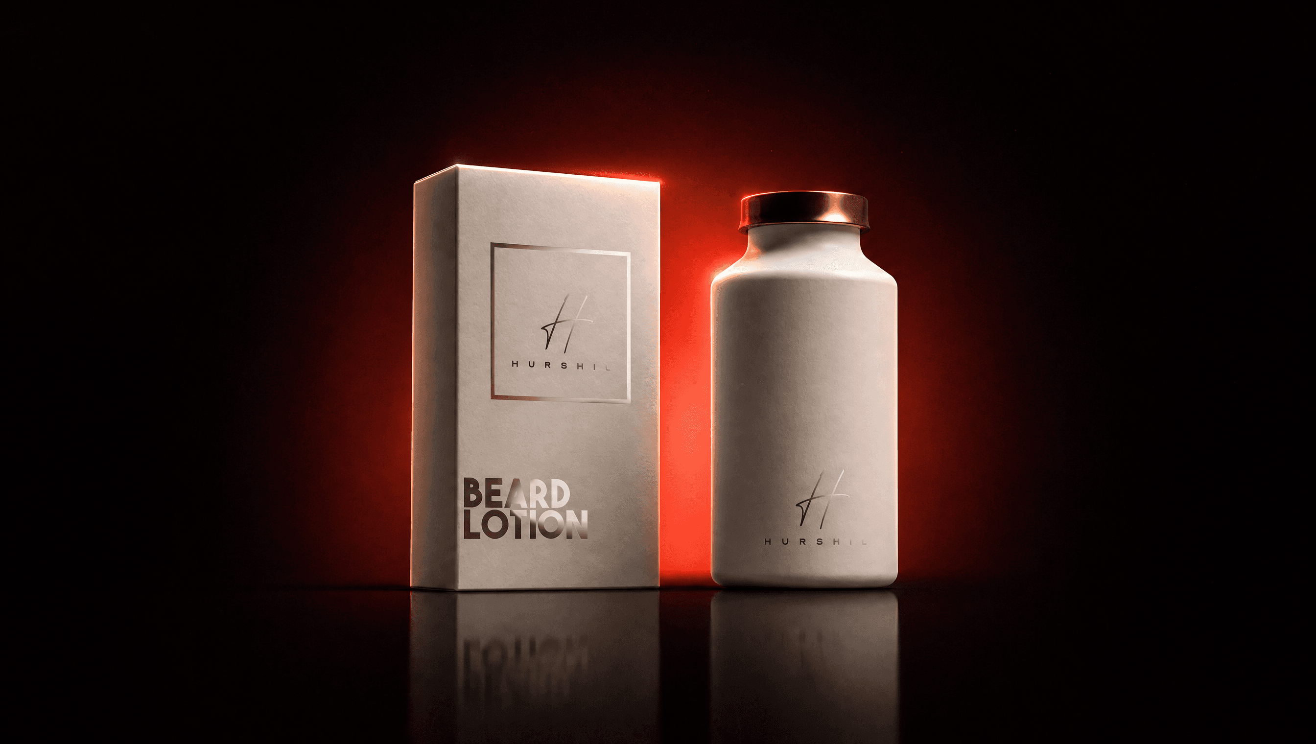
No client, no brief, just two things I wanted to get better at: making a mockup look convincingly real, and designing type I actually like. It turned into a set of packaging renders and a small Coldplay-inspired tee collection.
01 · Context
No client, just two things I wanted to get better at
Not every project here started with a brief. This one started with curiosity: I wanted to get better at two specific things, making a product mockup actually look real (the lighting, the material, the little imperfections that sell it), and designing type I'd actually want to wear.
The packaging side needed generic, ordinary categories, so the render was the whole point, not a brand strategy. The typography side needed something I actually cared about, so I picked Coldplay and let it become a small fan-made print collection.
02 · Role & process
Two threads, one habit: make it look real
Picked ordinary categories to mock up
Explored Coldplay typography
Built a small print set
Composited it onto apparel mockups
03 · Key decisions
Choices that came from practicing, not from a client
One mark across unrelated categories
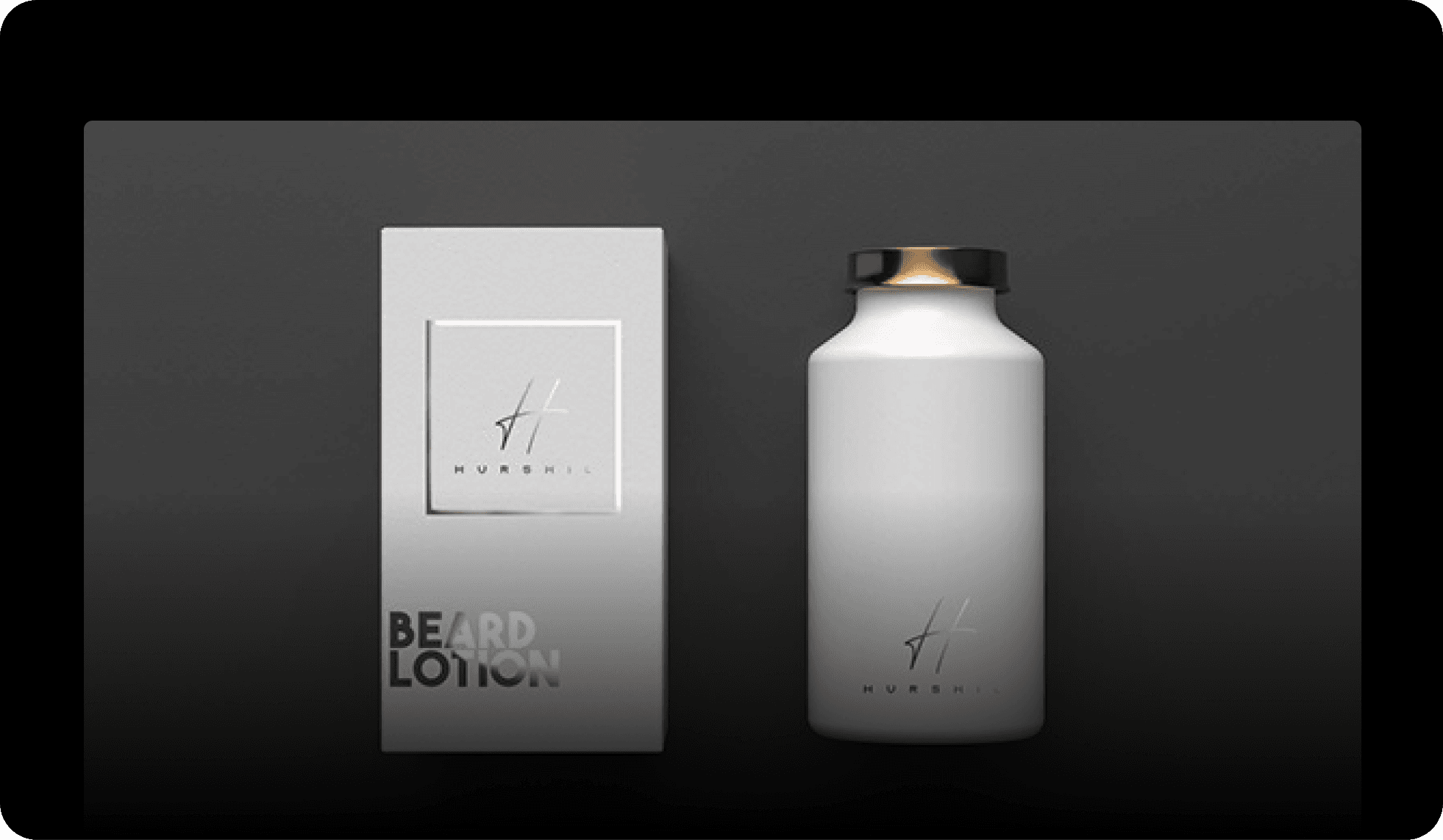
What. The same personal wordmark applied to a beard-care bottle, a tea pouch, a burger bag, and a coffee cup, instead of inventing a new brand for each one.
Why. The point was practicing render across materials, glass, foil, matte cardboard, waxed paper, not practicing brand strategy. One mark kept that the honest focus.
Tradeoff. None of it reads as a coherent brand the way a real client system would, and it isn't meant to.
Result. A small, consistent set that's really about the craft of the mockup, not a pitch for an imaginary product line.
Several wordmarks before picking one
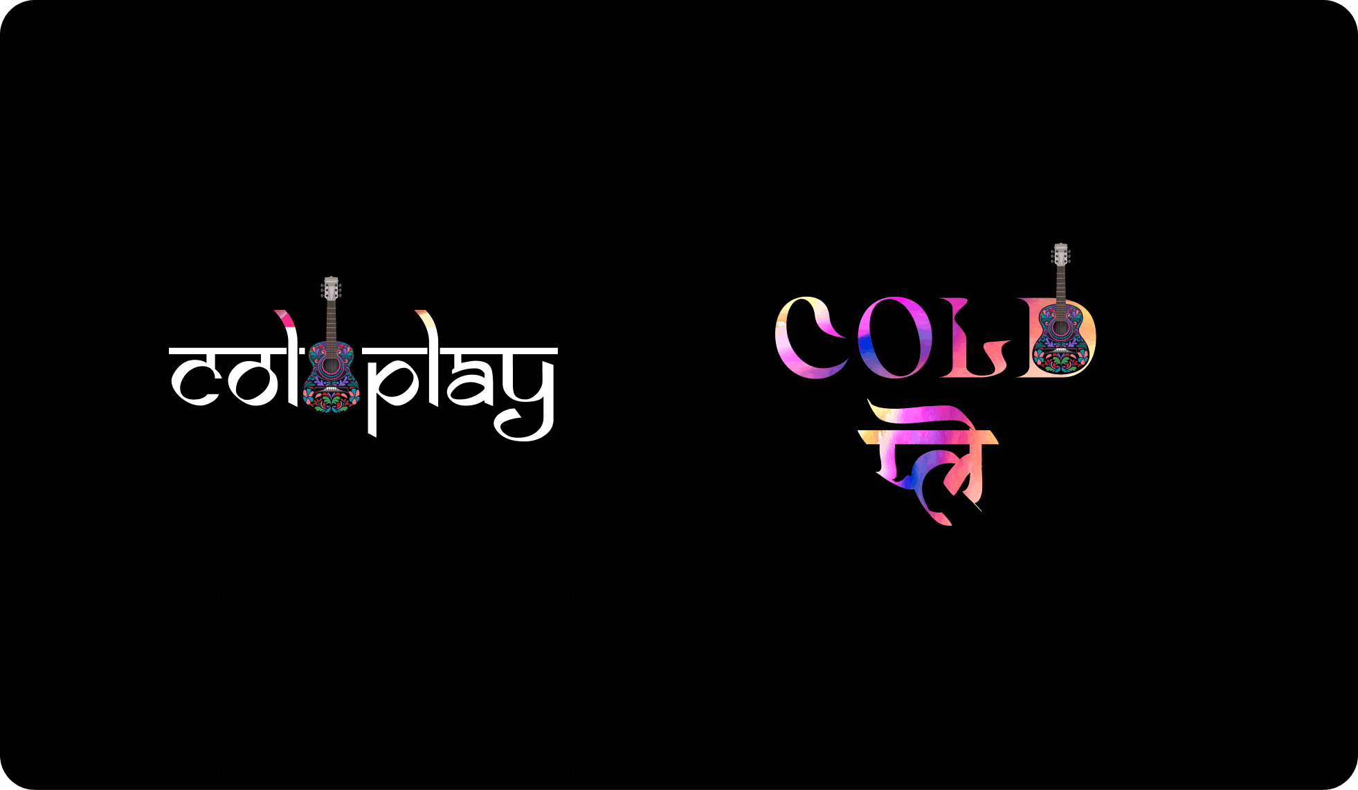
What. Tried a handful of different "Coldplay" logotype treatments, literal, bilingual, mascot-led, rather than settling on the first one that looked fine as a flat logo.
Why. A wordmark reads differently at a glance and on fabric than it does sitting flat in a design file. More attempts surfaced which ones actually held up once printed.
Tradeoff. Extra throwaway work, some of these never made it onto a shirt.
Result. A handful of marks that survived contact with an actual mockup, instead of one that might not have.
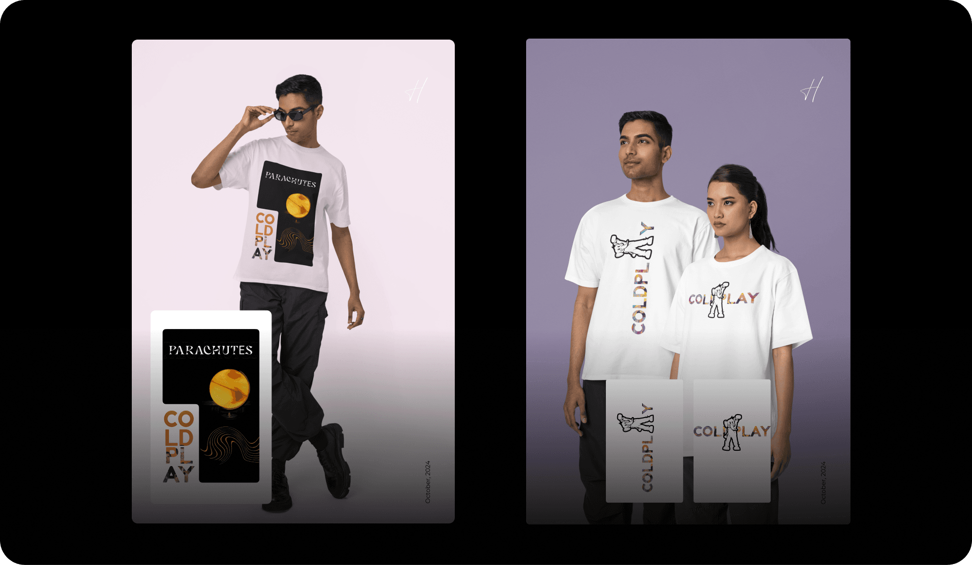
A small lookbook, not just flat mockups
What. Composited a few of the designs onto realistic worn-on-body shots, styled loosely like a real drop.
Why. A flat product shot hides scale and placement problems that only show up on a body, in real light, at a real size.
Tradeoff. More compositing work for something that's still fan art, not a real release.
Result. A set that reads like a finished, small collection instead of a folder of logo files.
04 · Solution & artifacts
What came out of it
Personal packaging mockups: a beard-care box and bottle, a pump bottle, a green tea pouch, and a fast-food bag and cup, one consistent mark across every material.
Coldplay wordmark explorations: a guitar built into the letterforms, an English/Devanagari bilingual version, and a mascot lockup.
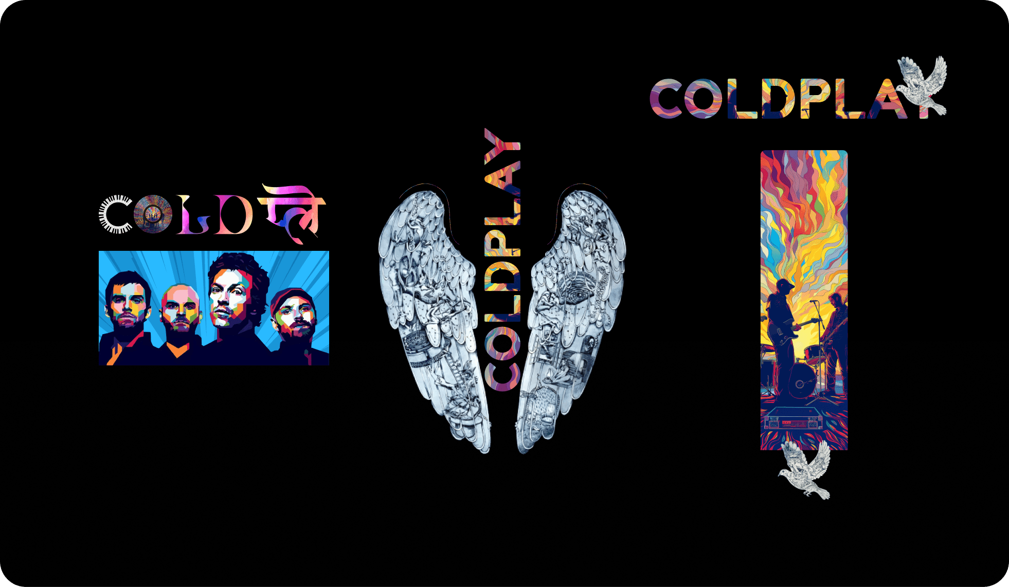
The print set: band-portrait pop art, a wings illustration, and a tour-poster-style scene.
Flat and worn mockups across tees and hoodies.
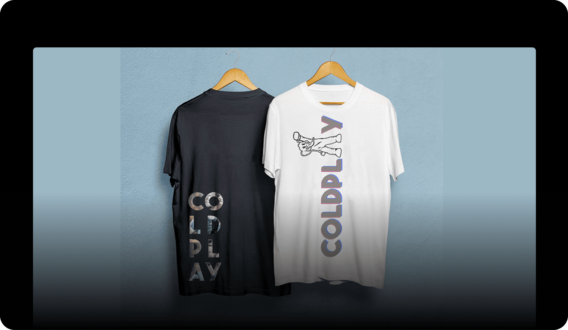
A small lookbook, styled like an actual drop.
05 · Impact
What I actually got out of it
There's no client feedback or sales number to report here, that was never the point. What I can point to: a sharper eye for what makes a mockup read as real instead of rendered, several wordmark treatments I'd reuse, and a small, finished print collection I'd genuinely wear. Practice that ends with something you'd actually use is practice that stuck.
06 · Reflection
Practice needs a real finish line too
It's tempting to let self-directed work stay loose forever, there's no client waiting, so nothing forces it to actually finish. Treating it like a real collection, complete print set, real mockups, a small lookbook, was what made it useful. The constraint I gave myself (one mark across every packaging category, several wordmarks before picking one) did the same job a client brief usually does: it kept the practice honest instead of just decorative.